Vue SDK
Crater Vue SDK is a library of ready-to-use Vue components. These components can help you embed invoicing and bill pay functionality into your Vue based web application with just a few lines of code.
Works with:


Installation
Step 1: Install the Crater Vue SDK via npm or yarn
The Crater Vue SDK package is available on the NPM and Yarn directories. To install:
npm install @craterapp/vue-sdk
Step 2: Configure CraterSDK instance
main.js
import { createApp } from 'vue'
import '@craterapp/vue-sdk/dist/style.css'
import { craterPlugin } from '@craterapp/vue-sdk'
import App from './App.vue'

const app = createApp(App)

app.use(craterPlugin, {
  tenantUrl: 'https://payments.your-domain.com', // We will provide you with the API URL to use
})

app.mount('#app')
Properties
- Name
tenantUrl- Type
- string
- Field Type
- Description
The URL for the API in use.
Step 3: Set Crater access token
In order to authorise the SDK components to access the Crater API, you need to first generate a business access token from your backend. Once you have the access token, you need to call setToken method to save the access token in the SDK.
You can view our Authentication documentation for more information on how to generate a new business access token.
Javascript
import { authService } from '@craterapp/vue-sdk'

authService.setToken(`YOUR_ACCESS_TOKEN`, `YOUR_BUSINESS_ID`)
setToken method accepts two parameters:
- Access Token: This is the access token generated from your backend.
- Business ID: This is the ID of the business you want to access.
Step 4: Import Components
Import the components you want to use from the Crater Vue SDK package.
Invoices.vue
import { InvoiceTable } from '@craterapp/vue-sdk';

<InvoiceTable />
Step 5: Review implementation
If you followed the above steps correctly, your code should look like this:
App.vue
  import { onMounted } from 'vue'
  import { InvoiceTable, authService } from '@craterapp/vue-sdk'

  onMounted(() => {
    generateToken()
  })

  async function generateToken() {
    fetch(`https://your-backend-api.com/access-token`)
      .then((response) => {
        authStore.setToken(response.token, response.businessId)
      })
      .catch((err) => {
        reject(err)
      })
  }
  <templte>
    <InvoiceTable />
  </template>
Step 6: Run the application
npm run start
Theme Config
You can use your own theme colors by updating the primary CSS variables inside :root selector.
style.css
:root {
    --cr-color-primary-50: 247, 246, 253;
    --cr-color-primary-100: 238, 238, 251;
    --cr-color-primary-200: 213, 212, 245;
    --cr-color-primary-300: 188, 185, 239;
    --cr-color-primary-400: 138, 133, 228;
    --cr-color-primary-500: 88, 81, 216;
    --cr-color-primary-600: 79, 73, 194;
    --cr-color-primary-700: 53, 49, 130;
    --cr-color-primary-800: 40, 36, 97;
    --cr-color-primary-900: 26, 24, 65;
}
You can use the Tailwind Shades Generator to generate your own color theme. Just make sure to change the css color variable names correctly as given above after you copy the theme from the shades generator.
Advanced Customization
The above section outlines the primary color palette variables, but you can also modify all the other color variables mentioned below if needed.
style.css
    :root {
        --cr-color-gray-50: 248, 250, 252;
        --cr-color-gray-100: 241, 245, 249;
        --cr-color-gray-200: 226, 232, 240;
        --cr-color-gray-300: 203, 213, 225;
        --cr-color-gray-400: 148, 163, 184;
        --cr-color-gray-500: 100, 116, 139;
        --cr-color-gray-600: 71, 85, 105;
        --cr-color-gray-700: 51, 65, 85;
        --cr-color-gray-800: 30, 41, 59;
        --cr-color-gray-900: 15, 23, 42;

        --cr-color-yellow-50: 254, 252, 232;
        --cr-color-yellow-100: 254, 249, 195;
        --cr-color-yellow-200: 254, 240, 138;
        --cr-color-yellow-300: 253, 224, 71;
        --cr-color-yellow-400: 250, 204, 21;
        --cr-color-yellow-500: 234, 179, 8;
        --cr-color-yellow-600: 202, 138, 4;
        --cr-color-yellow-700: 161, 98, 7;
        --cr-color-yellow-800: 133, 77, 14;
        --cr-color-yellow-900: 113, 63, 18;

        --cr-color-blue-50: 239, 246, 255;
        --cr-color-blue-100: 219, 234, 254;
        --cr-color-blue-200: 191, 219, 254;
        --cr-color-blue-300: 147, 197, 253;
        --cr-color-blue-400: 96, 165, 250;
        --cr-color-blue-500: 59, 130, 246;
        --cr-color-blue-600: 37, 99, 235;
        --cr-color-blue-700: 29, 78, 216;
        --cr-color-blue-800: 30, 64, 175;
        --cr-color-blue-900: 30, 58, 138;

        --cr-color-red-50: 254, 242, 242;
        --cr-color-red-100: 254, 226, 226;
        --cr-color-red-200: 254, 202, 202;
        --cr-color-red-300: 252, 165, 165;
        --cr-color-red-400: 248, 113, 113;
        --cr-color-red-500: 239, 68, 68;
        --cr-color-red-600: 220, 38, 38;
        --cr-color-red-700: 185, 28, 28;
        --cr-color-red-800: 153, 27, 27;
        --cr-color-red-900: 127, 29, 29;

        --cr-color-green-50: 240, 253, 244;
        --cr-color-green-100: 220, 252, 231;
        --cr-color-green-200: 187, 247, 208;
        --cr-color-green-300: 134, 239, 172;
        --cr-color-green-400: 74, 222, 128;
        --cr-color-green-500: 34, 197, 94;
        --cr-color-green-600: 22, 163, 74;
        --cr-color-green-700: 21, 128, 61;
        --cr-color-green-800: 22, 101, 52;
        --cr-color-green-900: 20, 83, 45;

        --cr-color-emerald-50: 236, 253, 245;
        --cr-color-emerald-100: 209, 250, 229;
        --cr-color-emerald-200: 167, 243, 208;
        --cr-color-emerald-300: 110, 231, 183;
        --cr-color-emerald-400: 52, 211, 153;
        --cr-color-emerald-500: 16, 185, 129;
        --cr-color-emerald-600: 5, 150, 105;
        --cr-color-emerald-700: 4, 120, 87;
        --cr-color-emerald-800: 6, 95, 70;
        --cr-color-emerald-900: 6, 78, 59;

        --cr-color-teal-50: 240, 253, 250;
        --cr-color-teal-100: 204, 251, 241;
        --cr-color-teal-200: 153, 246, 228;
        --cr-color-teal-300: 94, 234, 212;
        --cr-color-teal-400: 45, 212, 191;
        --cr-color-teal-500: 20, 184, 166;
        --cr-color-teal-600: 13, 148, 136;
        --cr-color-teal-700: 15, 118, 110;
        --cr-color-teal-800: 17, 94, 89;
        --cr-color-teal-900: 19, 78, 74;

        --cr-color-purple-50: 250, 245, 255;
        --cr-color-purple-100: 243, 232, 255;
        --cr-color-purple-200: 233, 213, 255;
        --cr-color-purple-300: 216, 180, 254;
        --cr-color-purple-400: 192, 132, 252;
        --cr-color-purple-500: 168, 85, 247;
        --cr-color-purple-600: 147, 51, 234;
        --cr-color-purple-700: 126, 34, 206;
        --cr-color-purple-800: 107, 33, 168;
        --cr-color-purple-900: 88, 28, 135;

        --cr-color-amber-50: 255, 251, 235;
        --cr-color-amber-100: 254, 243, 199;
        --cr-color-amber-200: 253, 230, 138;
        --cr-color-amber-300: 252, 211, 77;
        --cr-color-amber-400: 251, 191, 36;
        --cr-color-amber-500: 245, 158, 11;
        --cr-color-amber-600: 217, 119, 6;
        --cr-color-amber-700: 180, 83, 9;
        --cr-color-amber-800: 146, 64, 14;
        --cr-color-amber-900: 120, 53, 15;

        --cr-color-white: 255, 255, 255;

        --cr-color-black: 4, 4, 5;

        --cr-color-highlight: 56, 189, 248;
    }
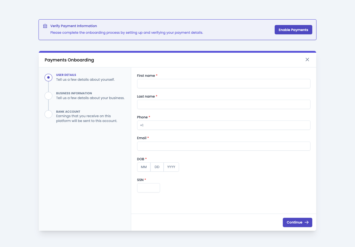
Payments Onboarding
This component displays the current onboarding status by default and provides an option to start the onboarding process if it is not completed yet. It is usually used on the dashboard of the application after the user is logged in.
Preview
Usage
Import the BusinessPaymentStatus component and use it in your application as shown below:
PaymentStatus.vue
import { BusinessPaymentStatus } from '@craterapp/vue-sdk';

<BusinessPaymentStatus />
Props
- Name
show-loader- Type
- boolean
- Field Type
optional- Description
This prop accepts boolean value to show / hide loader while fetching payment status.
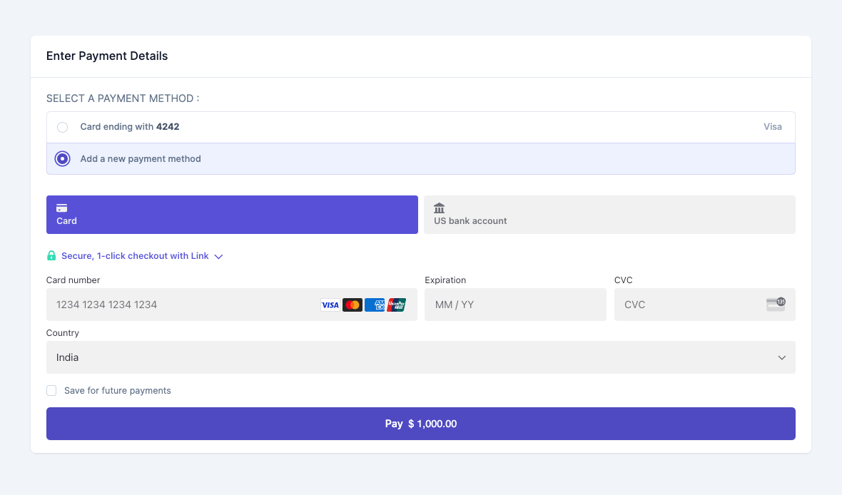
Payment Element
This component renders a payment form for paying a single invoice. It supports all the payment methods that are configured in your tenant settings.
Preview
Usage
Import the PaymentElement component and use it in your application as shown below:
PaymentElement.vue
  import { PaymentElement } from '@craterapp/vue-sdk';

  <PaymentElement
    invoice-id="INVOICE_ID"
    :stripe-theme="{
      colorPrimary: '#5851D8',
      fontFamily: 'Poppins, system-ui, sans-serif',
      spacingUnit: '4px',
      borderRadius: '4px',
      spacingGridRow: '12px',
      fontSizeBase: '16px',
      fontSizeSm: '14px',
    }"
  />
Props
- Name
invoice-id- Type
- string
- Field Type
required- Description
This is a required prop that accepts the ID of the invoice to be paid.
- Name
stripe-theme- Type
- object
- Field Type
optional- Description
This prop accepts stripe theme object to apply theme to stripe element.
Events
- Name
succeeded- Type
- Field Type
- Description
Triggered when payment is succeeded.
- Name
processing- Type
- Field Type
- Description
Triggered when payment is processing.
- Name
error- Type
- Field Type
- Description
Triggered when payment has error.
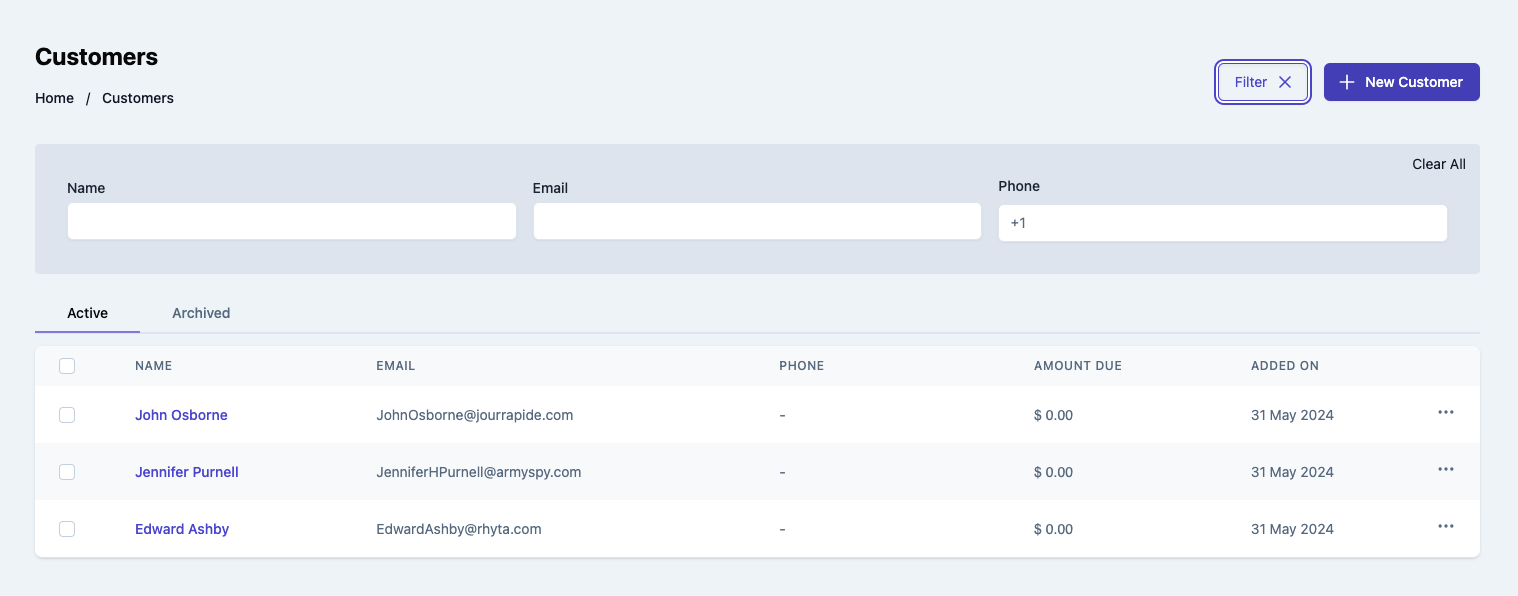
Customer Table
This component displays a table of all customers. The component shows each customer's name, email and amount due as well as other required details.
Preview
Usage
Renders a table of customers. Use the CustomerTable component in your application as shown below:
Customers.vue
import { CustomerTable } from '@craterapp/vue-sdk';

<CustomerTable
  type="both"
  :show-create-button="false"
  :show-table-title="false"
  :show-filters="false"
  :show-tabs="false"
  @create="onCreateCustomer"
  @view="onViewCustomer"
/>
Props
- Name
type- Type
- string
- Field Type
optional- Description
This is prop accepts type with value
active,archivedandboth, default value isboth.
- Name
show-create-button- Type
- boolean
- Field Type
optional- Description
This prop accepts boolean value to show / hide customer create button. default value is
true.
- Name
show-table-title- Type
- boolean
- Field Type
optional- Description
This prop accepts boolean value to show / hide customer table title. default value is
true.
- Name
show-filters- Type
- boolean
- Field Type
optional- Description
This prop accepts boolean value to show / hide filters button. default value is
true.
- Name
show-tabs- Type
- boolean
- Field Type
optional- Description
This prop accepts boolean value to show / hide tabs. default value is
true.
- Name
apply-filters- Type
- object
- Field Type
optional- Description
This prop accepts object with
name,email,phone,archived, key and its value for applying filter.
- Name
columns- Type
- array
- Field Type
optional- Description
This prop accepts array to customize columns of table. you can pass columns key which you want to show in table.
Available keys:
['checkbox', 'name', 'email', 'phone', 'due_amount', 'created_at', 'actions']Example:
If you pass['name', 'email', 'phone', 'due_amount',], the table will only display these columns.Additionally, you can pass an array of objects with available keys (
'key', 'label', 'thClass', 'tdClass', 'sortable') to override the default properties of a column.<CustomerTable :columns="[{ key: 'email', label: 'Customer Email', thClass: 'text-left', tdClass: 'text-left', sortable: true, }]" />You can also pass a combination of both arrays and objects to customize the columns of the table.
<CustomerTable
  :columns="[
    'name',
    {
      key: 'email',
      label: 'Status',
      sortable: false
    }
  ]"
/>
Events
- Name
create- Type
- Field Type
- Description
Triggered when customer create button clicked.
- Name
view- Type
- Field Type
- Description
Triggered when customer view option clicked from options menu.
Slots
- Name
customHeader- Type
- Field Type
- Description
This slot allows you to add custom header in customer table component.
<CustomerTable>
  <template #customHeader>
    <div class="flex justify-between">
      <h1 class="text-2xl">
        Customers
      </h1>
      <div class="flex items-center">
        <button type="button" class="mr-2">
          Create
        </button>
      </div>
    </div>
  </template>
</CustomerTable>
- Name
breadcrumb- Type
- Field Type
- Description
This slot allows you to add custom breadcrumb in customer table component.
  <CustomerTable>
    <template #breadcrumb>
      <Breadcrumb>
        <BreadcrumbItem title="Home" />
        <BreadcrumbItem title="Customers" active/>
      </Breadcrumb>
    </template>
  </CustomerTable>
Customer Details
This component renders UI to view details of a single customer and allows performing various actions on the customer.
Preview
Usage
Use the CustomerDetails component to view details of an existing customer.
Customer.vue
import { CustomerDetails } from '@craterapp/vue-sdk';

<CustomerDetails id="CUSTOMER_ID" />
Props
- Name
id- Type
- string
- Field Type
required- Description
This is a required prop that accepts the ID of the customer details to be displayed.
- Name
show-edit-option- Type
- boolean
- Field Type
optional- Description
This prop accepts boolean value to show / hide edit option.
Slots
- Name
customHeader- Type
- Field Type
- Description
This slot allows you to add custom header in customer details component.
<CustomerDetails id="CUSTOMER_ID">
  <template #customHeader>
    <div class="flex justify-between">
      <h1 class="text-2xl">
        Customer
      </h1>
      <div class="flex items-center">
        <button type="button" class="mr-2">
          Create
        </button>
      </div>
    </div>
  </template>
</CustomerDetails>
- Name
breadcrumb- Type
- Field Type
- Description
This slot allows you to add custom breadcrumb in customer details component.
  <CustomerDetails id="CUSTOMER_ID">
    <template #breadcrumb="slotProps">
      <Breadcrumb>
        <BreadcrumbItem title="Home" />
        <BreadcrumbItem :title="slotProps.data.customerData.name" active/>
      </Breadcrumb>
    </template>
  </CustomerDetails>
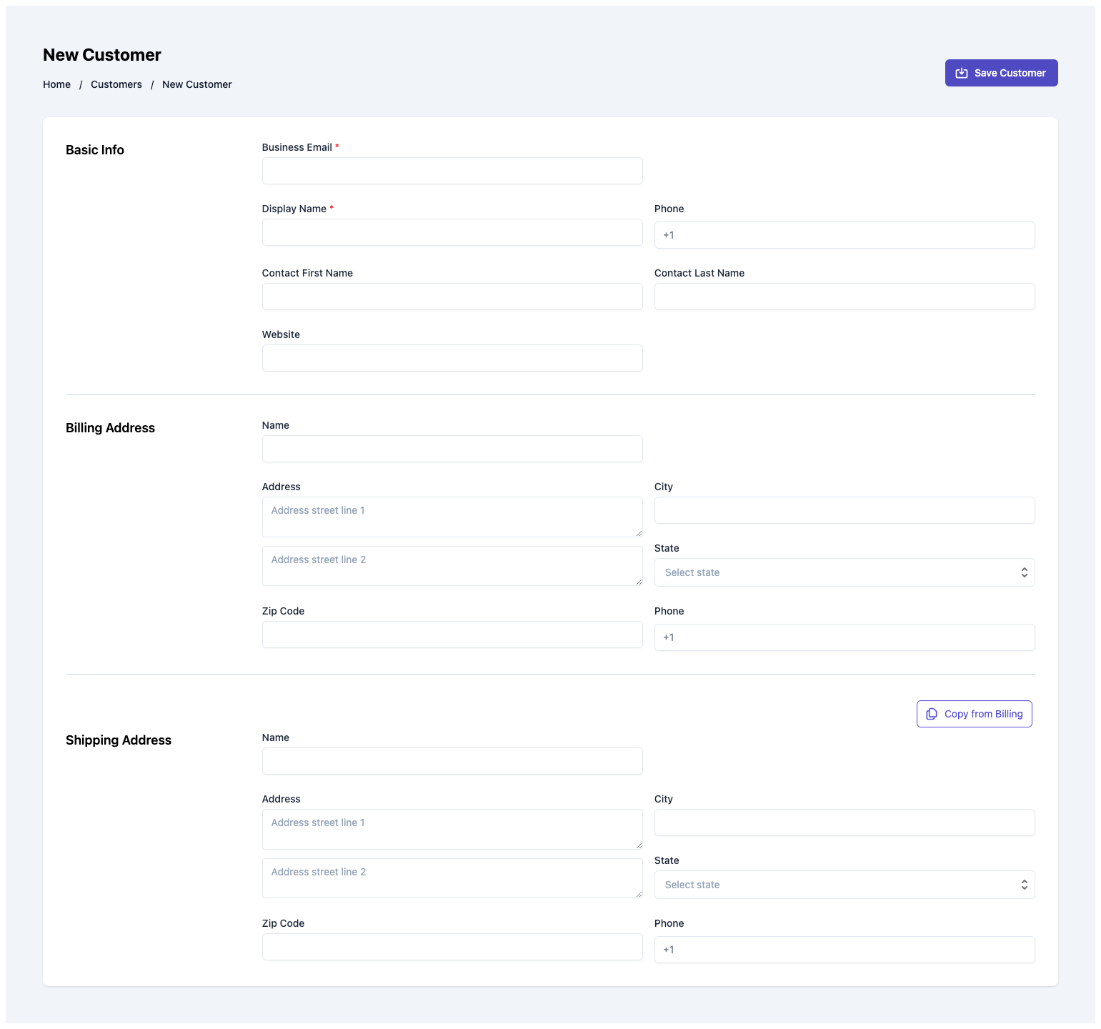
Customer Create
This component serves as an interface for users to input and submit information essential for creating a new customer. It handles the UI elements, data validation, and submission of the form.
Preview
Usage
Renders a form for creating a new customer. Use the CustomerCreate component in your application as shown below:
CustomerCreate.vue
import { CustomerCreate } from '@craterapp/vue-sdk';

<CustomerCreate :show-detail-on-success="false" @create="onCustomerCreate" />
Props
- Name
show-detail-on-success- Type
- boolean
- Field Type
optional- Description
This prop accepts boolean value to show / hide customer details component after customer created successfully, default value is
true.
Events
- Name
create- Type
- function
- Field Type
- Description
Triggered when a customer is created successfully.
Slots
- Name
customHeader- Type
- Field Type
- Description
This slot allows you to add custom header in customer create component.
<CustomerCreate>
  <template #customHeader>
    <div class="flex justify-between">
      <h1 class="text-2xl">
        Customer Create
      </h1>
      <div class="flex items-center">
        <button type="button" class="mr-2">
          Save
        </button>
      </div>
    </div>
  </template>
</CustomerCreate>
- Name
breadcrumb- Type
- Field Type
- Description
This slot allows you to add custom breadcrumb in customer create component.
  <CustomerCreate>
    <template #breadcrumb>
      <Breadcrumb>
        <BreadcrumbItem title="Home" />
        <BreadcrumbItem title="Customers"/>
        <BreadcrumbItem title="New Customer" active/>
      </Breadcrumb>
    </template>
  </CustomerCreate>
Vendor Table
This component displays a table of all vendors. The component shows each vendor's name, email and phone as well as other required details.
Preview
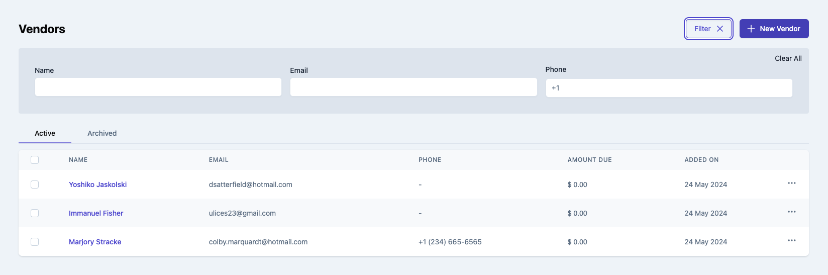
Usage
Renders a table of vendor. Use the VendorTable component in your application as shown below:
VendorTable.vue
import { VendorTable } from '@craterapp/vue-sdk';

<VendorTable
  type="both"
  :show-create-button="false"
  :show-view-option="false"
  :show-table-title="false"
  :show-filters="false"
  :show-Tabs="false"
  @create="onCreateVendor"
  @view="onViewVendor"
/>
Props
- Name
type- Type
- string
- Field Type
optional- Description
This is prop accepts type with value
active,archivedandboth, default value isboth.
- Name
show-create-button- Type
- boolean
- Field Type
optional- Description
This prop accepts boolean value to show / hide vendor create button, default value is
true.
- Name
show-view-option- Type
- boolean
- Field Type
optional- Description
This prop accepts boolean value to show / hide vendor view option, default value is
true.
- Name
show-table-title- Type
- boolean
- Field Type
optional- Description
This prop accepts boolean value to show / hide vendor table title, default value is
true.
- Name
show-filters- Type
- boolean
- Field Type
optional- Description
This prop accepts boolean value to show / hide filters button, default value is
true.
- Name
show-Tabs- Type
- boolean
- Field Type
optional- Description
This prop accepts boolean value to show / hide vendor status tabs, default value is
true.
- Name
apply-filters- Type
- object
- Field Type
optional- Description
This prop accepts object with 'name', 'email', 'phone' key and its value for applying filter.
- Name
columns- Type
- array
- Field Type
optional- Description
This prop accepts array to customize columns of table. you can pass columns key which you want to show in table.
Available keys:
['checkbox', 'name', 'email', 'phone', 'due_amount', 'created_at', 'actions']Example:
If you pass['checkbox','name', 'email', 'phone', 'due_amount'], the table will only display these columns.Additionally, you can pass an array of objects with available keys (
'key', 'label', 'thClass', 'tdClass', 'sortable') to override the default properties of a column.<VendorTable :columns="[{ key: 'name', label: 'Vendor Name', thClass: 'table-cell', tdClass: 'table-cell', sortable: true, } ]" />You can also pass a combination of both arrays and objects to customize the columns of the table.
<VendorTable
  :columns="[
    'name',
    {
      key: 'phone',
      label: 'Phone',
      sortable: false
    }
  ]"
/>
Events
- Name
create- Type
- Field Type
- Description
Triggered when vendor create button clicked.
- Name
view- Type
- Field Type
- Description
Triggered when vendor view option clicked from options menu.
Slots
- Name
customHeader- Type
- Field Type
- Description
This slot allows you to add custom header in vendor table component.
<VendorTable>
  <template #customHeader>
    <div class="flex justify-between">
      <h1 class="text-2xl">
        Vendors
      </h1>
      <div class="flex items-center">
        <button type="button" class="mr-2">
          Create
        </button>
      </div>
    </div>
  </template>
</VendorTable>
- Name
breadcrumb- Type
- Field Type
- Description
This slot allows you to add custom breadcrumb in vendor table component.
  <VendorTable>
    <template #breadcrumb>
      <Breadcrumb>
        <BreadcrumbItem title="Home" />
        <BreadcrumbItem title="Vendors" active/>
      </Breadcrumb>
    </template>
  </VendorTable>
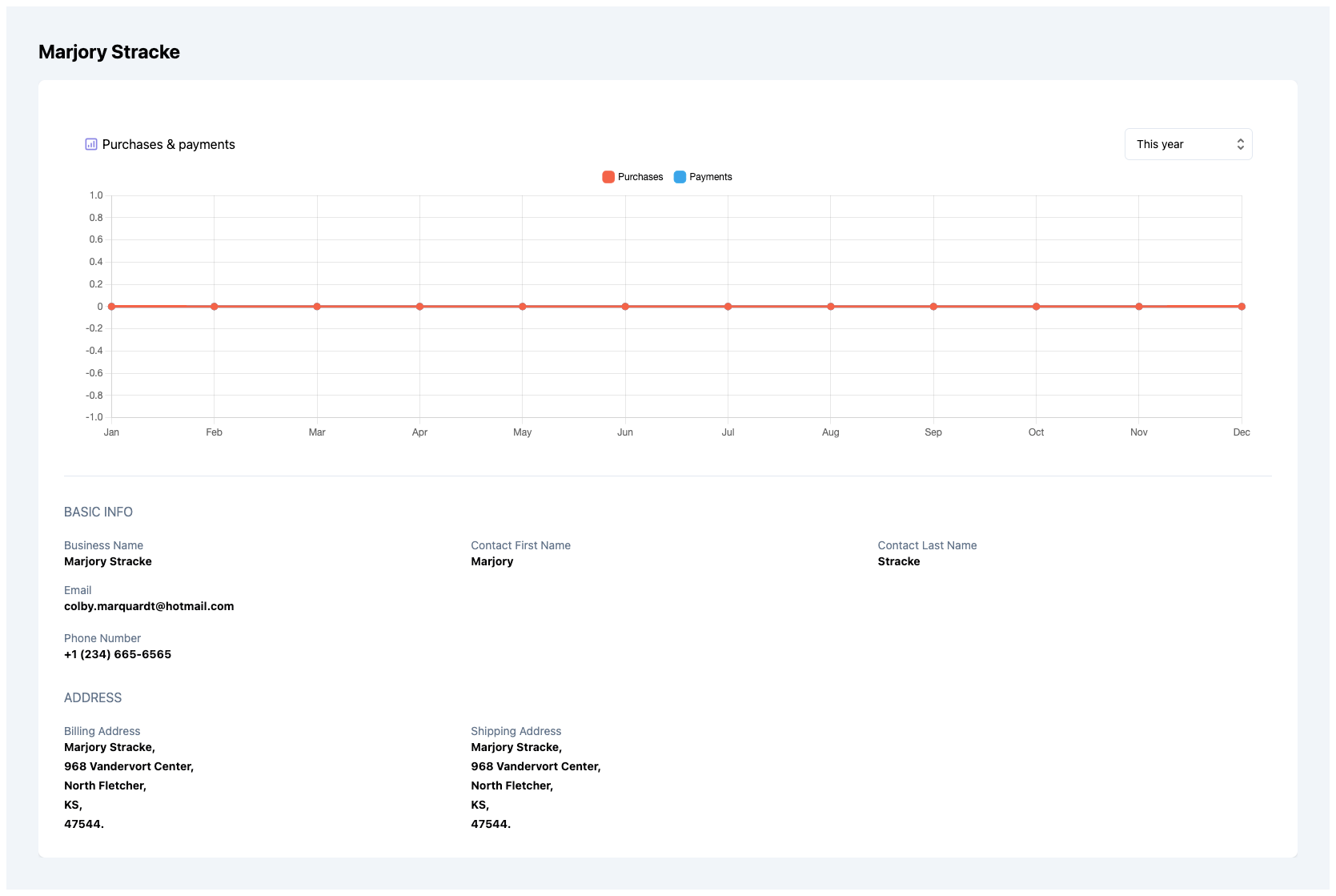
Vendor Details
This component renders the interface for displaying an existing vendor.
Preview
Usage
Use the VendorDetails component to view details of an existing vendor.
VendorDetails.vue
import { VendorDetails } from '@craterapp/vue-sdk';

<VendorDetails id="VENDOR_ID" />
Props
- Name
id- Type
- string
- Field Type
required- Description
This is a required prop that accepts the ID of the vendor details to be displayed.
Slots
- Name
customHeader- Type
- Field Type
- Description
This slot allows you to add custom header in vendor details component.
<VendorDetails id="VENDOR_ID">
  <template #customHeader>
    <div class="flex justify-between">
      <h1 class="text-2xl">
        Vendor
      </h1>
      <div class="flex items-center">
        <button type="button" class="mr-2">
          Create
        </button>
      </div>
    </div>
  </template>
</VendorDetails>
- Name
breadcrumb- Type
- Field Type
- Description
This slot allows you to add custom breadcrumb in vendor details component.
  <VendorDetails id="VENDOR_ID">
    <template #breadcrumb="slotProps">
      <Breadcrumb>
        <BreadcrumbItem title="Home" />
        <BreadcrumbItem :title="slotProps.data.vendorData.name" active/>
      </Breadcrumb>
    </template>
  </VendorDetails>
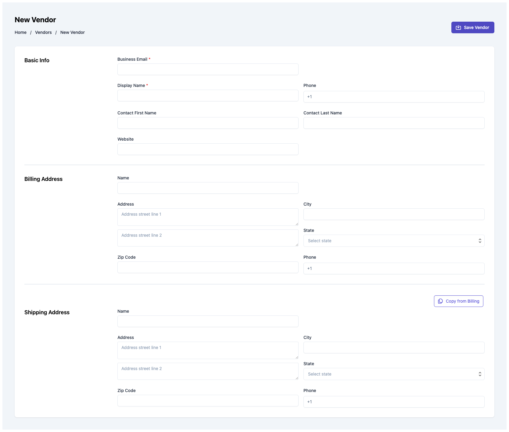
Vendor Create
This component serves as an interface for users to input and submit information essential for generating a new vendor. It handles the UI elements & data validation to create vendor within your application.
Preview
Usage
Renders a form for creating a new vendor. Use the VendorCreate component in your application as shown below:
VendorCreate.vue
import { VendorCreate } from '@craterapp/vue-sdk';

<VendorCreate :show-detail-on-success="false"  @create="onCreateVendor" />
Props
- Name
show-detail-on-success- Type
- boolean
- Field Type
optional- Description
This prop accepts boolean value to show / hide vendor details component after vendor created successfully, default value is
true.
Events
- Name
create- Type
- function
- Field Type
- Description
Triggered when a vendor is created successfully.
Slots
- Name
customHeader- Type
- Field Type
- Description
This slot allows you to add custom header in vendor create component.
<VendorCreate>
  <template #customHeader>
    <div class="flex justify-between">
      <h1 class="text-2xl">
        Vendor Create
      </h1>
      <div class="flex items-center">
        <button type="button" class="mr-2">
          Save
        </button>
      </div>
    </div>
  </template>
</VendorCreate>
- Name
breadcrumb- Type
- Field Type
- Description
This slot allows you to add custom breadcrumb in vendor create component.
  <VendorCreate>
    <template #breadcrumb>
      <Breadcrumb>
        <BreadcrumbItem title="Home" />
        <BreadcrumbItem title="Vendors" />
        <BreadcrumbItem title="New Vendor" active/>
      </Breadcrumb>
    </template>
  </VendorCreate>
Item Table
This component displays a table of all items. The component shows each item's name, unit name and created at as well as other required details.
Preview
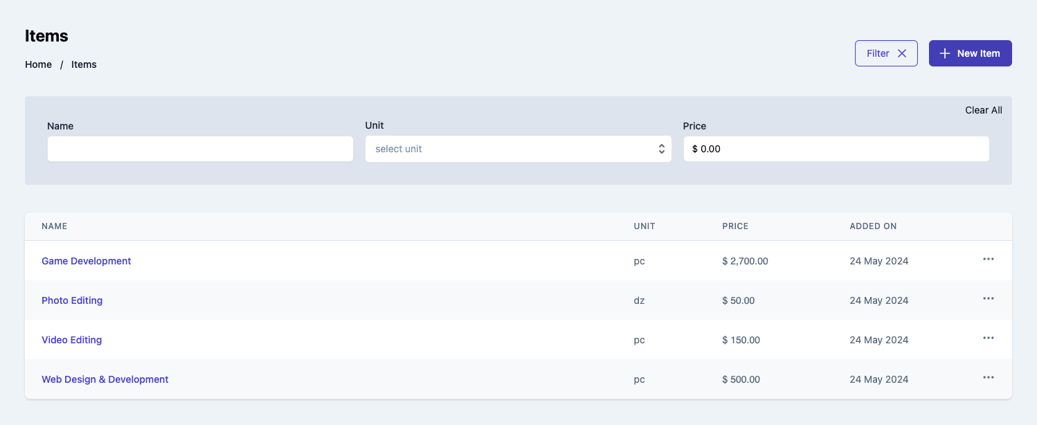
Usage
Renders a table of items. Use the ItemTable component in your application as shown below:
ItemTable.vue
import { ItemTable } from '@craterapp/vue-sdk';

<ItemTable
  :show-create-button="false"
  :show-view-option="false"
  :show-edit-option="false"
  :show-table-title="false"
  :show-delete-option="false"
  :show-filters="false"
  @create="ItemCreate"
  @view="onItemView"
  @edit="onItemEdit"
 />
Props
- Name
show-create-button- Type
- boolean
- Field Type
optional- Description
This prop accepts boolean value to show / hide item create button, default value is
true.
- Name
show-view-button- Type
- boolean
- Field Type
optional- Description
This prop accepts boolean value to show / hide item view option, default value is
true.
- Name
show-edit-button- Type
- boolean
- Field Type
optional- Description
This prop accepts boolean value to show / hide item edit option, default value is
true.
- Name
show-delete-button- Type
- boolean
- Field Type
optional- Description
This prop accepts boolean value to show / hide item delete option, default value is
true.
- Name
show-table-title- Type
- boolean
- Field Type
optional- Description
This prop accepts boolean value to show / hide item table title, default value is
true.
- Name
show-filters- Type
- boolean
- Field Type
optional- Description
This prop accepts boolean value to show / hide filters button, default value is
true.
- Name
apply-filters- Type
- object
- Field Type
optional- Description
This prop accepts object with
name,unit,pricekey and its value for applying filter.
- Name
columns- Type
- array
- Field Type
optional- Description
This prop accepts array to customize columns of table. you can pass columns key which you want to show in table.
Available keys:
['name', 'unit_name', 'price', 'created_at', 'actions']Example:
If you pass['unit_name', 'price', 'created_at'], the table will only display these columns.Additionally, you can pass an array of objects with available keys (
'key', 'label', 'thClass', 'tdClass', 'sortable') to override the default properties of a column.<ItemTable :columns="[{ key: 'name', label: 'Item name', thClass: 'table-cell', tdClass: 'table-cell', sortable: true, }]" />You can also pass a combination of both arrays and objects to customize the columns of the table.
<ItemTable
  :columns="[
    'name',
    {
      key: 'price',
      label: 'Price',
      sortable: false
    }
  ]"
/>
Events
- Name
create- Type
- Field Type
- Description
Triggered when item create button clicked.
- Name
view- Type
- Field Type
- Description
Triggered when item view option clicked from options menu.
- Name
edit- Type
- Field Type
- Description
Triggered when item edit option clicked from options menu.
Slots
- Name
customHeader- Type
- Field Type
- Description
This slot allows you to add custom header in item table component.
<ItemTable>
  <template #customHeader>
    <div class="flex justify-between">
      <h1 class="text-2xl">
        Items
      </h1>
      <div class="flex items-center">
        <button type="button" class="mr-2">
          Edit
        </button>
      </div>
    </div>
  </template>
</ItemTable>
- Name
breadcrumb- Type
- Field Type
- Description
This slot allows you to add custom breadcrumb in item table component.
  <ItemTable>
    <template #breadcrumb>
      <Breadcrumb>
        <BreadcrumbItem title="Home" />
        <BreadcrumbItem title="Items" active/>
      </Breadcrumb>
    </template>
  </ItemTable>
Item Details
This component renders the interface for displaying an existing item. It also allows performing various actions on the item such as editing and deleting it.
Preview
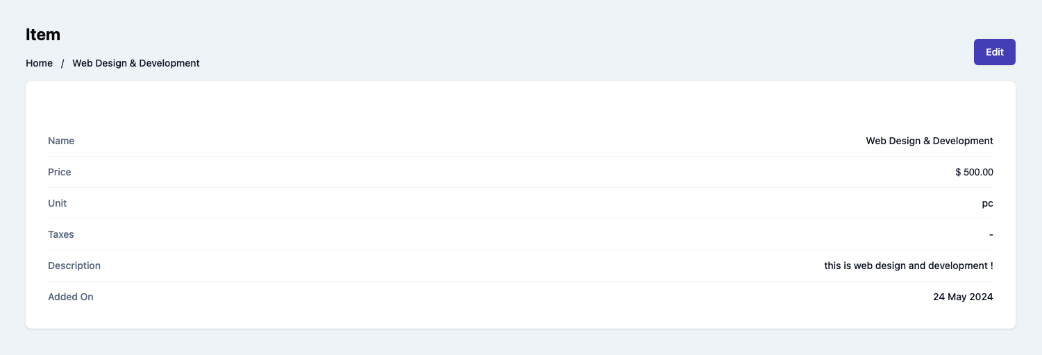
Usage
Use the ItemDetails component to view details of an existing item.
ItemDetails.vue
import { ItemDetails } from '@craterapp/vue-sdk';

<ItemDetails id="ITEM_ID" @edit="onItemEdit" />
Props
- Name
id- Type
- string
- Field Type
required- Description
This is a required prop that accepts the ID of the item details to be displayed.
- Name
show-edit-option- Type
- boolean
- Field Type
optional- Description
This prop accepts boolean value to show / hide edit option, default value is
true.
Events
- Name
edit- Type
- Field Type
- Description
Triggered when item edit button clicked.
Slots
- Name
customHeader- Type
- Field Type
- Description
This slot allows you to add custom header in item details component.
<ItemDetails id="ITEM_ID" @edit="onItemEdit">
  <template #customHeader>
    <div class="flex justify-between">
      <h1 class="text-2xl">
        Item
      </h1>
      <div class="flex items-center">
        <button type="button" class="mr-2">
          Edit
        </button>
      </div>
    </div>
  </template>
</ItemDetails>
- Name
breadcrumb- Type
- Field Type
- Description
This slot allows you to add custom breadcrumb in item details component.
  <ItemDetails id="ITEM_ID" @edit="onItemEdit">
    <template #breadcrumb="slotProps">
      <Breadcrumb>
        <BreadcrumbItem title="Home" />
        <BreadcrumbItem :title="slotProps.data.itemData.name" active/>
      </Breadcrumb>
    </template>
  </ItemDetails>
Item Create
This component serves as an interface for users to input and submit information essential for generating a new item. It handles the UI elements & data validation to create items within your application.
Preview
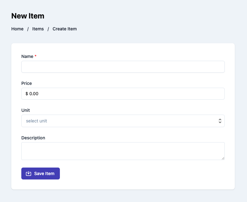
Usage
Renders a form for creating a new item. Use the ItemCreate component in your application as shown below:
ItemCreate.vue
import { ItemCreate } from '@craterapp/vue-sdk';

<ItemCreate :show-details-on-success="false" @create="onItemCreate" />
Props
- Name
show-detail-on-success- Type
- boolean
- Field Type
optional- Description
This prop accepts boolean value to show / hide item details component after item created successfully, default value is
true.
Events
- Name
create- Type
- function
- Field Type
- Description
Triggered when a item is created successfully.
Slots
- Name
customHeader- Type
- Field Type
- Description
This slot allows you to add custom header in item create component.
<ItemCreate>
  <template #customHeader>
    <div class="flex justify-between">
      <h1 class="text-2xl">
        Item Create
      </h1>
      <div class="flex items-center">
        <button type="button" class="mr-2">
          Create
        </button>
      </div>
    </div>
  </template>
</ItemCreate>
- Name
breadcrumb- Type
- Field Type
- Description
This slot allows you to add custom breadcrumb in item create component.
  <ItemCreate>
    <template #breadcrumb>
      <Breadcrumb>
        <BreadcrumbItem title="Home" />
        <BreadcrumbItem title="Items"/>
        <BreadcrumbItem title="Create Item" active/>
      </Breadcrumb>
    </template>
  </ItemCreate>
Item Edit
This component renders a form for editing a pre-existing item. It encompasses functionalities tailored to allow users to update specific details of an item.
Preview
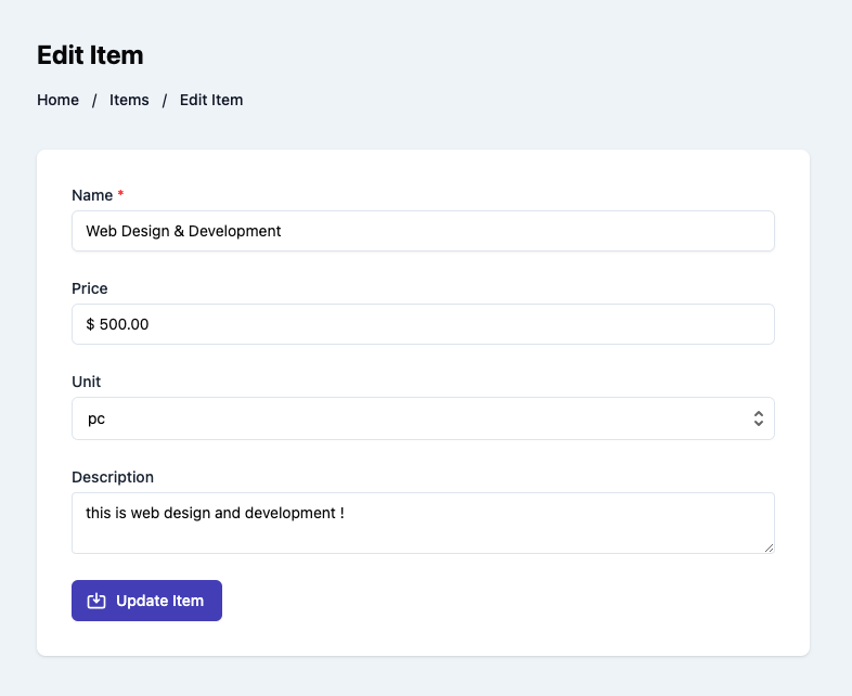
Usage
Renders a form for editing an existing item. Use the ItemEdit component in your application as shown below:
ItemEdit.vue
import { ItemEdit } from '@craterapp/vue-sdk';

<ItemEdit id="ITEM_ID" :show-detail-on-success="false" @edit="onItemEdit" />
Props
- Name
id- Type
- string
- Field Type
required- Description
This is a required prop that accepts the ID of the item.
- Name
show-detail-on-success- Type
- boolean
- Field Type
optional- Description
This prop accepts boolean value to show / hide item details component after item updated successfully, default value is
true.
Events
- Name
edit- Type
- Field Type
- Description
Triggered when the item is updated successfully.
Slots
- Name
customHeader- Type
- Field Type
- Description
This slot allows you to add custom header in item edit component.
<ItemEdit id="ITEM_ID">
  <template #customHeader>
    <div class="flex justify-between">
      <h1 class="text-2xl">
        Item Edit
      </h1>
      <div class="flex items-center">
        <button type="button" class="mr-2">
          Save
        </button>
      </div>
    </div>
  </template>
</ItemEdit>
- Name
breadcrumb- Type
- Field Type
- Description
This slot allows you to add custom breadcrumb in item edit component.
  <ItemEdit id="ITEM_ID">
    <template #breadcrumb>
      <Breadcrumb>
        <BreadcrumbItem title="Home" />
        <BreadcrumbItem title="Items"/>
        <BreadcrumbItem title="Edit Item" active/>
      </Breadcrumb>
    </template>
  </ItemEdit>
Estimate Table
This component displays all estimates created by a business. The component shows each estimate's amount, status, due date, overdue date, and the counterpart to which they were sent.
Preview
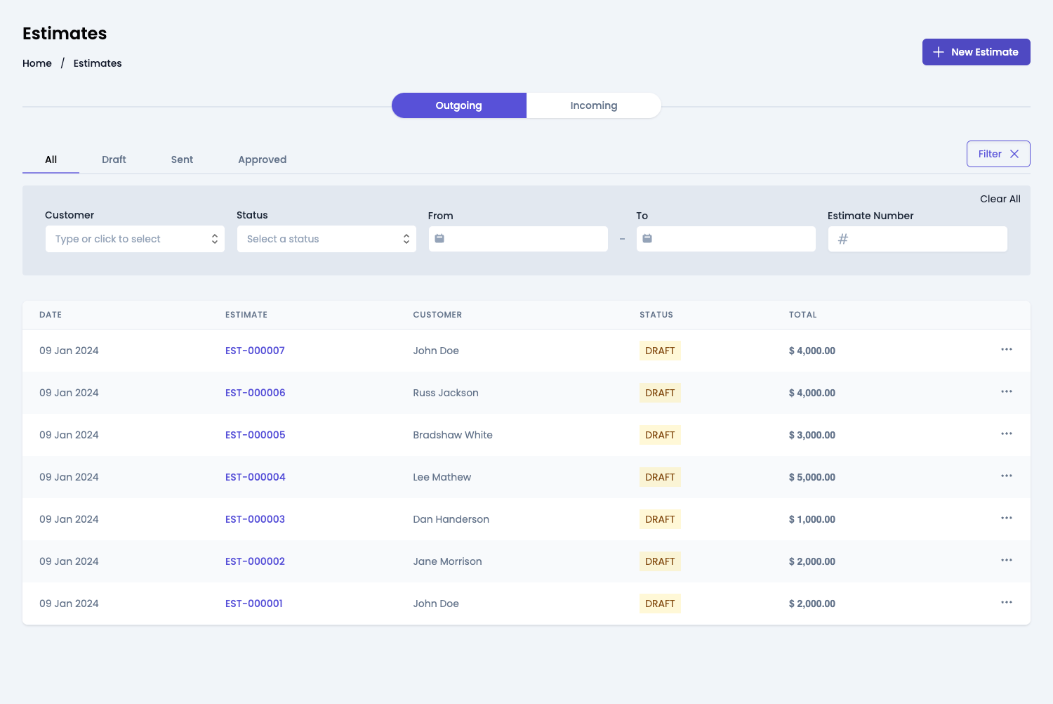
Usage
Import the EstimateTable component and use it in your application as shown below:
Estimates.vue
import { EstimateTable } from '@craterapp/vue-sdk';

<EstimateTable
  :show-filters="false"
  :show-create-button="false"
  :show-table-title="false"
  :show-tabs="false"
  :show-edit-option="false"
  :show-delete-option="false"
  :show-send-estimate="false"
  :show-approve-estimate="false"
  :show-reject-estimate="false"
  :show-finalize-estimate="false"
  :show-void-option="false"
  @create="onEstimateCreate"
  @edit="onEstimateEdit"
  @view="onEstimateView"
/>
Props
- Name
show-filters- Type
- boolean
- Field Type
optional- Description
This prop accepts boolean value to show / hide filters button, default value is
true.
- Name
apply-filters- Type
- object
- Field Type
optional- Description
This prop accepts object with
customer_id,status,from_date,to_date,estimate_numberkey and its value for applying filter.
- Name
show-table-title- Type
- boolean
- Field Type
optional- Description
This prop accepts boolean value to show / hide estimate table title, default value is
true.
- Name
show-tabs- Type
- boolean
- Field Type
optional- Description
This prop accepts boolean value to show / hide estimate status tabs, default value is
true.
- Name
show-create-button- Type
- boolean
- Field Type
optional- Description
This prop accepts boolean value to show / hide estimate create button, default value is
true.
- Name
show-edit-option- Type
- boolean
- Field Type
optional- Description
This prop accepts boolean value to show / hide estimate edit option in table, default value is
true.
- Name
show-delete-option- Type
- boolean
- Field Type
optional- Description
This prop accepts boolean value to show / hide estimate delete option in table, default value is
true.
- Name
show-send-estimate- Type
- boolean
- Field Type
optional- Description
This prop accepts boolean value to show / hide estimate send option in table, default value is
true.
- Name
show-approve-estimate- Type
- boolean
- Field Type
optional- Description
This prop accepts boolean value to show / hide estimate approve option in table, default value is
true.
- Name
show-reject-estimate- Type
- boolean
- Field Type
optional- Description
This prop accepts boolean value to show / hide estimate reject option in table, default value is
true.
- Name
show-finalize-estimate- Type
- boolean
- Field Type
optional- Description
This prop accepts boolean value to show / hide estimate finalize option in table, default value is
true.
- Name
show-void-option- Type
- boolean
- Field Type
optional- Description
This prop accepts boolean value to show / hide estimate void option in table, default value is
true.
- Name
columns- Type
- array
- Field Type
optional- Description
This prop accepts array to customize columns of table. you can pass columns key which you want to show in table.
Available keys:
['checkbox', 'estimate_date', 'estimate_number', 'business_name', 'status', 'total', 'convert', 'actions']Example:
If you pass['estimate_date', 'estimate_number', 'business_name', 'status'], the table will only display these columns.Additionally, you can pass an array of objects with available keys (
'key', 'label', 'thClass', 'tdClass', 'sortable') to override the default properties of a column.<EstimateTable :columns="[{ key: 'estimate_number', label: 'Estimate Number', thClass: 'text-left', tdClass: 'text-left', sortable: true, }]" />You can also pass a combination of both arrays and objects to customize the columns of the table.
<EstimateTable
  :columns="[
    'estimate_number',
    {
      key: 'status',
      label: 'Status',
      sortable: false
    }
  ]"
/>
Events
- Name
create- Type
- Field Type
- Description
Triggered when estimate create button clicked.
- Name
edit- Type
- Field Type
- Description
Triggered when estimate edit option clicked from options menu.
- Name
view- Type
- Field Type
- Description
Triggered when estimate view option clicked from options menu.
Slots
- Name
customHeader- Type
- Field Type
- Description
This slot allows you to add custom header in estimate table component.
<EstimateTable>
  <template #customHeader>
    <div class="flex justify-between">
      <h1 class="text-2xl">
        Estimates
      </h1>
      <div class="flex items-center">
        <button type="button" class="mr-2">
          Create
        </button>
      </div>
    </div>
  </template>
</EstimateTable>
- Name
breadcrumb- Type
- Field Type
- Description
This slot allows you to add custom breadcrumb in estimate table component.
  <EstimateTable>
    <template #breadcrumb>
      <Breadcrumb>
        <BreadcrumbItem title="Home" />
        <BreadcrumbItem title="Estimates" active/>
      </Breadcrumb>
    </template>
  </EstimateTable>
Estimate Details
This component renders the interface for displaying an existing estimate. It also allows performing various actions on the estimate such as editing, deleting, and sending it.
Preview
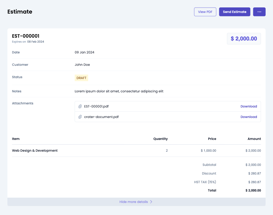
Usage
Use the EstimateDetails component to view details of an existing estimate.
EstimateDetails.vue
import { EstimateDetails } from '@craterapp/vue-sdk';

<EstimateDetails
id="ESTIAMTE_ID"
:show-edit-option="false"
:show-delete-option="false"
:show-send-estimate="false"
:show-approve-estimate="false"
:show-reject-estimate="false"
:show-void-option="false"
:show-finalize-button="false"
@edit="onEstimateEdit"
/>
Props
- Name
id- Type
- string
- Field Type
required- Description
This is a required prop that accepts the ID of the estimate details to be displayed.
- Name
show-edit-option- Type
- boolean
- Field Type
optional- Description
This is a optional prop that accepts the boolean value to show / hide edit option, default value is
true.
- Name
show-delete-option- Type
- boolean
- Field Type
optional- Description
This is a optional prop that accepts the boolean value to show / hide delete option, default value is
true.
- Name
show-send-estimate- Type
- boolean
- Field Type
optional- Description
This is a optional prop that accepts the boolean value to show / hide send estimate option, default value is
true.
- Name
show-approve-estimate- Type
- boolean
- Field Type
optional- Description
This is a optional prop that accepts the boolean value to show / hide approve estimate option, default value is
true.
- Name
show-reject-estimate- Type
- boolean
- Field Type
optional- Description
This is a optional prop that accepts the boolean value to show / hide reject estimate option, default value is
true.
- Name
show-void-option- Type
- boolean
- Field Type
optional- Description
This is a optional prop that accepts the boolean value to show / hide void estimate option, default value is
true.
- Name
show-finalize-button- Type
- boolean
- Field Type
optional- Description
This is a optional prop that accepts the boolean value to show / hide finalize estimate button, default value is
true.
- Name
card-container-class- Type
- string
- Field Type
optional- Description
This is a optional prop that accepts classes which applies to card container.
Events
- Name
edit- Type
- Field Type
- Description
Triggered when invoice edit option clicked from options menu.
Slots
- Name
customHeader- Type
- Field Type
- Description
This slot allows you to add custom header in estimate details component.
<EstimateDetails id="ESTIMATE_ID">
  <template #customHeader>
    <div class="flex justify-between">
      <h1 class="text-2xl">
        Estimate
      </h1>
      <div class="flex items-center">
        <button type="button" class="mr-2">
          Edit
        </button>
      </div>
    </div>
  </template>
</EstimateDetails>
- Name
breadcrumb- Type
- Field Type
- Description
This slot allows you to add custom breadcrumb in estimate details component.
  <EstimateDetails id="ESTIMATE_ID">
    <template #breadcrumb="slotProps">
      <Breadcrumb>
        <BreadcrumbItem title="Home" />
        <BreadcrumbItem :title="slotProps.data.estimateData.estimate_number" active/>
      </Breadcrumb>
    </template>
  </EstimateDetails>
Estimate Create
This component serves as an interface for users to input and submit information essential for generating a new estimate. It handles the UI elements & data validation to create estimates within your application.
Preview
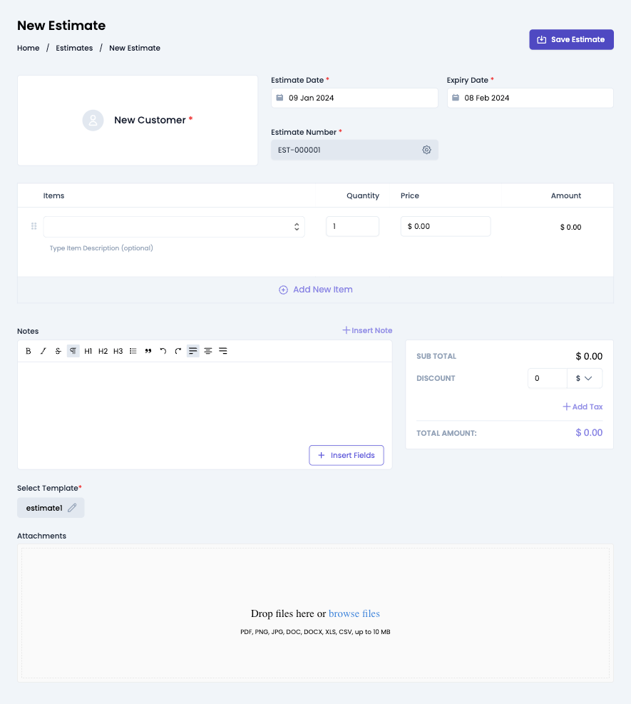
Usage
Import the EstimateCreate component and use it in your application as shown below:
EstimateCreate.vue
  import { EstimateCreate } from '@craterapp/vue-sdk';

  <EstimateCreate :show-detail-on-success="false" @create="onEstimatecreate" />
Props
- Name
show-detail-on-success- Type
- boolean
- Field Type
optional- Description
This prop accepts boolean value to show / hide estimate details component after estimate created successfully, default value is
true.
Events
- Name
create- Type
- Field Type
- Description
Triggered when an estimate is created successfully.
Slots
- Name
customHeader- Type
- Field Type
- Description
This slot allows you to add custom header in estimate create component.
<EstimateCreate>
  <template #customHeader>
    <div class="flex justify-between">
      <h1 class="text-2xl">
        Estimate Create
      </h1>
      <div class="flex items-center">
        <button type="button" class="mr-2">
          Save
        </button>
      </div>
    </div>
  </template>
</EstimateCreate>
- Name
breadcrumb- Type
- Field Type
- Description
This slot allows you to add custom breadcrumb in estimate create component.
  <EstimateCreate>
    <template #breadcrumb>
      <Breadcrumb>
        <BreadcrumbItem title="Home" />
        <BreadcrumbItem title="Estimates" />
        <BreadcrumbItem title="New Estimate" active/>
      </Breadcrumb>
    </template>
  </EstimateCreate>
Estimate Edit
This component renders a form for editing a pre-existing estimate. It encompasses functionalities tailored to allow users to update specific details of an estimate.
Preview
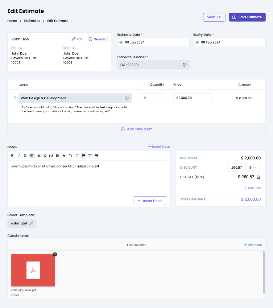
Usage
Import the EstimateEdit component and use it in your application as shown below:
EstimateEdit.vue
<EstimateEdit id="ESTIMATE_ID" :show-detail-on-success="false" @edit="onEstimateEdit" />
Props
- Name
id- Type
- string
- Field Type
required- Description
This is a required prop that accepts the ID of the estimate.
- Name
show-detail-on-success- Type
- boolean
- Field Type
optional- Description
This prop accepts boolean value to show / hide estimate details component after estimate updated successfully.
Events
- Name
edit- Type
- Field Type
- Description
Triggered when the estimate is updated successfully.
Slots
- Name
customHeader- Type
- Field Type
- Description
This slot allows you to add custom header in estimate edit component.
<EstimateEdit id="ESTIMATE_ID">
  <template #customHeader>
    <div class="flex justify-between">
      <h1 class="text-2xl">
        Estimate Edit
      </h1>
      <div class="flex items-center">
        <button type="button" class="mr-2">
          Save
        </button>
      </div>
    </div>
  </template>
</EstimateEdit>
- Name
breadcrumb- Type
- Field Type
- Description
This slot allows you to add custom breadcrumb in estimate edit component.
  <EstimateEdit id="ESTIMATE_ID">
    <template #breadcrumb>
      <Breadcrumb>
        <BreadcrumbItem title="Home" />
        <BreadcrumbItem title="Estimates" />
        <BreadcrumbItem title="Edit Estimate" active/>
      </Breadcrumb>
    </template>
  </EstimateEdit>
Invoice Table
This component displays all invoices created by a business. The component shows each invoice's amount, status, due date, overdue date, and the counterpart to which they were sent.
Preview
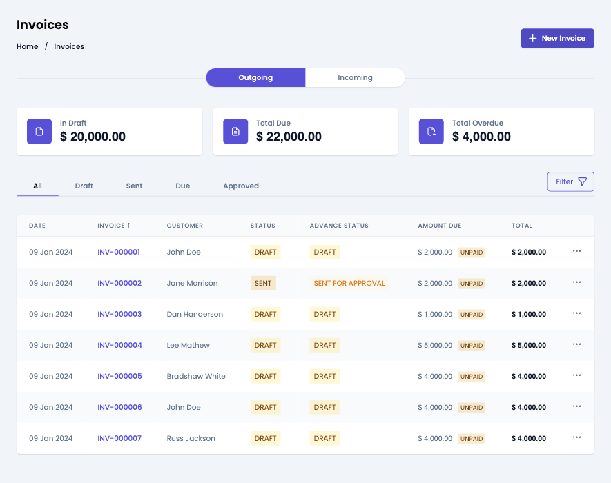
Usage
Renders a table of invoices. Use in the InvoiceTable component in your application as shown:
Invoices.vue
import { InvoiceTable } from '@craterapp/vue-sdk';

<InvoiceTable
  :show-stats="false"
  :show-filters="false"
  :show-table-title="false"
  :show-tabs="false"
  :show-create-button="false"
  :show-edit-option="false"
  :show-delete-option="false"
  :show-send-invoice="false"
  :show-clone-invoice="false"
  :show-approve-invoice="false"
  :show-finalize-option="false"
  :show-void-option="false"
  :show-pay-invoice="false"
  @create="onCreateInvoice"
  @edit="onEditInvoice"
  @view="onViewInvoice"
/>
Props
- Name
show-stats- Type
- boolean
- Field Type
optional- Description
This prop accepts boolean value to show / hide stats section, default value is
true.
- Name
show-filters- Type
- boolean
- Field Type
optional- Description
This prop accepts boolean value to show / hide filters button, default value is
true.
- Name
apply-filters- Type
- object
- Field Type
optional- Description
This prop accepts object with
customer_id,status,paid_status,from_date,to_date,invoice_number,tab_statuskey and its value for applying filter.
- Name
show-table-title- Type
- boolean
- Field Type
optional- Description
This prop accepts boolean value to show / hide invoice table title, default value is
true.
- Name
show-tabs- Type
- boolean
- Field Type
optional- Description
This prop accepts boolean value to show / hide invoice status tabs, default value is
true.
- Name
show-create-button- Type
- boolean
- Field Type
optional- Description
This prop accepts boolean value to show / hide invoice create button, default value is
true.
- Name
show-edit-option- Type
- boolean
- Field Type
optional- Description
This prop accepts boolean value to show / hide invoice edit option in table, default value is
true.
- Name
show-delete-option- Type
- boolean
- Field Type
optional- Description
This prop accepts boolean value to show / hide invoice delete option in table, default value is
true.
- Name
show-send-invoice- Type
- boolean
- Field Type
optional- Description
This prop accepts boolean value to show / hide invoice send option in table, default value is
true.
- Name
show-clone-invoice- Type
- boolean
- Field Type
optional- Description
This prop accepts boolean value to show / hide invoice clone option in table, default value is
true.
- Name
show-approve-invoice- Type
- boolean
- Field Type
optional- Description
This prop accepts boolean value to show / hide invoice approve option in table, default value is
true.
- Name
show-finalize-option- Type
- boolean
- Field Type
optional- Description
This prop accepts boolean value to show / hide invoice finalize option in table, default value is
true.
- Name
show-void-option- Type
- boolean
- Field Type
optional- Description
This prop accepts boolean value to show / hide invoice void option in table, default value is
true.
- Name
show-pay-invoice- Type
- boolean
- Field Type
optional- Description
This prop accepts boolean value to show / hide invoice pay option in table, default value is
true.
- Name
columns- Type
- array
- Field Type
optional- Description
This prop accepts array to customize columns of table. you can pass columns key which you want to show in table.
Available keys:
['checkbox', 'invoice_date', 'invoice_number', 'business_name', 'status', 'loan_status', 'due_amount', 'total', 'advance', 'actions']Example:
If you pass['invoice_number', 'customer', 'total', 'due_date', 'status'], the table will only display these columns.Additionally, you can pass an array of objects with available keys (
'key', 'label', 'thClass', 'tdClass', 'sortable') to override the default properties of a column.<InvoiceTable :columns="[{ key: 'invoice_number', label: 'Invoice Number', thClass: 'text-left', tdClass: 'text-left', sortable: true, }]" />You can also pass a combination of both arrays and objects to customize the columns of the table.
<InvoiceTable
  :columns="[
    'invoice_number',
    {
      key: 'status',
      label: 'Status',
      sortable: false
    }
  ]"
/>
Events
- Name
create- Type
- Field Type
- Description
Triggered when invoice create button clicked.
- Name
edit- Type
- Field Type
- Description
Triggered when invoice edit option clicked from options menu.
- Name
view- Type
- Field Type
- Description
Triggered when invoice view option clicked from options menu.
Slots
- Name
customHeader- Type
- Field Type
- Description
This slot allows you to add custom header in invoice table component.
<InvoiceTable>
  <template #customHeader>
    <div class="flex justify-between">
      <h1 class="text-2xl">
        Invoices
      </h1>
      <div class="flex items-center">
        <button type="button" class="mr-2">
          Create
        </button>
      </div>
    </div>
  </template>
</InvoiceTable>
- Name
breadcrumb- Type
- Field Type
- Description
This slot allows you to add custom breadcrumb in invoice table component.
  <InvoiceTable>
    <template #breadcrumb>
      <Breadcrumb>
        <BreadcrumbItem title="Home" />
        <BreadcrumbItem title="Ivoices" active/>
      </Breadcrumb>
    </template>
  </InvoiceTable>
Invoice Details
This component renders the interface for displaying an existing invoice. It also allows performing various actions on the invoice such as editing, deleting, and sending it.
Preview
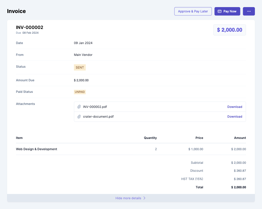
Usage
To view details of an existing invoice, use the InvoiceDetails component with the id prop as shown:
InvoiceDetails.vue
import { InvoiceDetails } from '@craterapp/vue-sdk';

<InvoiceDetails
  id="INVOICE_ID"
  :show-edit-option="true"
  :show-delete-option="false"
  :show-send-invoice="false"
  :show-clone-invoice="false"
  :show-approve-invoice="false"
  :show-pay-invoice="false"
  :show-void-option="false"
  :show-finalize-button="false"
  @edit="onEditInvoice"
/>
Props
- Name
id- Type
- string
- Field Type
required- Description
This is a required prop that accepts the ID of the invoice details to be displayed.
- Name
show-edit-option- Type
- boolean
- Field Type
optional- Description
This is a optional prop that accepts the boolean value to show / hide edit option, default value is
true.
- Name
show-delete-option- Type
- boolean
- Field Type
optional- Description
This is a optional prop that accepts the boolean value to show / hide delete option, default value is
true.
- Name
show-send-invoice- Type
- boolean
- Field Type
optional- Description
This is a optional prop that accepts the boolean value to show / hide send invoice option, default value is
true.
- Name
show-clone-invoice- Type
- boolean
- Field Type
optional- Description
This is a optional prop that accepts the boolean value to show / hide clone invoice, default value is
true.
- Name
show-approve-invoice- Type
- boolean
- Field Type
optional- Description
This is a optional prop that accepts the boolean value to show / hide approve invoice option, default value is
true.
- Name
show-pay-invoice- Type
- boolean
- Field Type
optional- Description
This is a optional prop that accepts the boolean value to show / hide pay invoice button, default value is
true.
- Name
show-void-option- Type
- boolean
- Field Type
optional- Description
This is a optional prop that accepts the boolean value to show / hide void invoice option, default value is
true.
- Name
show-finalize-button- Type
- boolean
- Field Type
optional- Description
This is a optional prop that accepts the boolean value to show / hide finalize invoice button, default value is
true.
- Name
card-container-class- Type
- string
- Field Type
optional- Description
This is a optional prop that accepts classes which applies to card container.
Events
- Name
edit- Type
- Field Type
- Description
Triggered when invoice edit option clicked from options menu.
Slots
- Name
customHeader- Type
- Field Type
- Description
This slot allows you to add custom header in invoice details component.
<InvoiceDetails id="INVOICE_ID">
  <template #customHeader>
    <div class="flex justify-between">
      <h1 class="text-2xl">
        Invoice
      </h1>
      <div class="flex items-center">
        <button type="button" class="mr-2">
          Edit
        </button>
      </div>
    </div>
  </template>
</InvoiceDetails>
- Name
breadcrumb- Type
- Field Type
- Description
This slot allows you to add custom breadcrumb in invoice details component.
  <InvoiceDetails id="INVOICE_ID">
    <template #breadcrumb="slotProps">
      <Breadcrumb>
        <BreadcrumbItem title="Home" />
        <BreadcrumbItem :title="slotProps.data.invoiceData.invoice_number" active/>
      </Breadcrumb>
    </template>
  </InvoiceDetails>
Invoice Create
This component serves as an interface for users to input and submit information essential for generating a new invoice. It handles the UI elements & data validation to create invoices within your application.
Preview
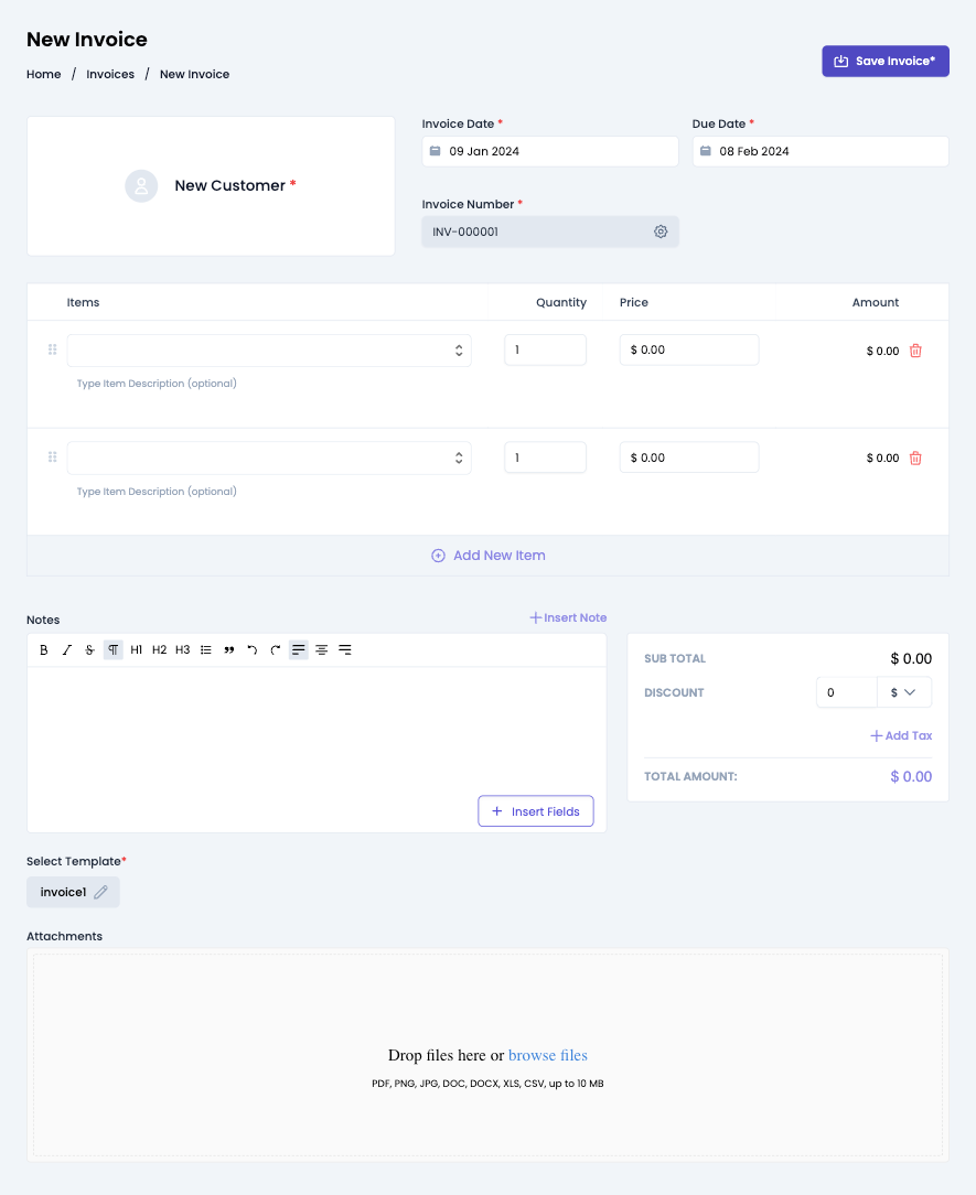
Usage
Renders a form for creating a new invoice. Use in the InvoiceCreate component in your application as shown:
InvoiceCreate.vue
import { InvoiceCreate } from '@craterapp/vue-sdk';

<InvoiceCreate :show-detail-on-success="false" @create="onInvoiceCreate" />
Props
- Name
show-detail-on-success- Type
- boolean
- Field Type
optional- Description
This prop accepts boolean value to show / hide invoice details component after invoice created successfully, default value is
true.
Events
- Name
create- Type
- Field Type
- Description
Triggered when an invoice is created successfully.
Slots
- Name
customHeader- Type
- Field Type
- Description
This slot allows you to add custom header in invoice create component.
<InvoiceCreate>
  <template #customHeader>
    <div class="flex justify-between">
      <h1 class="text-2xl">
        Invoice Create
      </h1>
      <div class="flex items-center">
        <button type="button" class="mr-2">
          Save
        </button>
      </div>
    </div>
  </template>
</InvoiceCreate>
- Name
breadcrumb- Type
- Field Type
- Description
This slot allows you to add custom breadcrumb in invoice create component.
  <InvoiceCreate>
    <template #breadcrumb>
      <Breadcrumb>
        <BreadcrumbItem title="Home" />
        <BreadcrumbItem title="Invoices" />
        <BreadcrumbItem title="New Invoice" active/>
      </Breadcrumb>
    </template>
  </InvoiceCreate>
Invoice Edit
This component renders a form for editing a pre-existing invoice. It encompasses functionalities tailored to allow users to update specific details of an invoice.
Preview
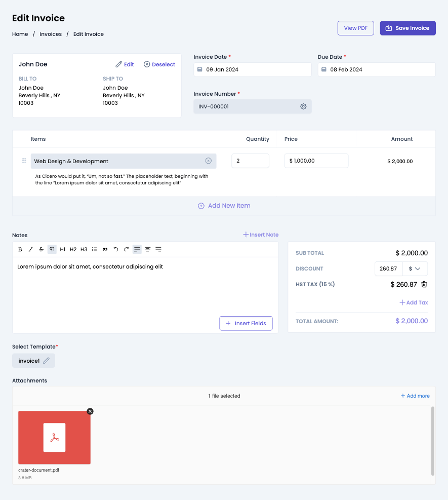
Usage
Renders a form for editing an existing invoice. Use in the InvoiceEdit component in your application as shown below:
InvoiceEdit.vue
import { InvoiceEdit } from '@craterapp/vue-sdk';

<InvoiceEdit id="INVOICE_ID" :show-detail-on-success="false" @edit="onInvoiceEdit" />
Props
- Name
id- Type
- string
- Field Type
required- Description
This is a required prop that accepts the ID of the invoice.
- Name
show-detail-on-success- Type
- boolean
- Field Type
optional- Description
This prop accepts boolean value to show / hide invoice details component after invoice edited successfully.
Events
- Name
edit- Type
- Field Type
- Description
Triggered when the invoice is updated successfully.
Slots
- Name
customHeader- Type
- Field Type
- Description
This slot allows you to add custom header in invoice edit component.
<InvoiceEdit id="INVOCIE_ID">
  <template #customHeader>
    <div class="flex justify-between">
      <h1 class="text-2xl">
        Invoice Edit
      </h1>
      <div class="flex items-center">
        <button type="button" class="mr-2">
          Save
        </button>
      </div>
    </div>
  </template>
</InvoiceEdit>
- Name
breadcrumb- Type
- Field Type
- Description
This slot allows you to add custom breadcrumb in invoice edit component.
  <InvoiceEdit id="INVOCIE_ID">
    <template #breadcrumb>
      <Breadcrumb>
        <BreadcrumbItem title="Home" />
        <BreadcrumbItem title="Invoices" />
        <BreadcrumbItem title="Edit Invoice" active/>
      </Breadcrumb>
    </template>
  </InvoiceEdit>
Invoice Approve
This component serves as an interface for users to approve and schedule payment for invoice. It handles the UI elements & data validation to create invoices within your application.
Preview
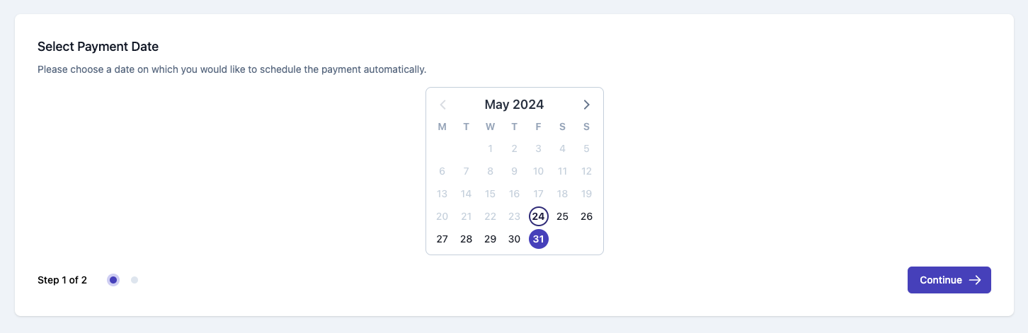
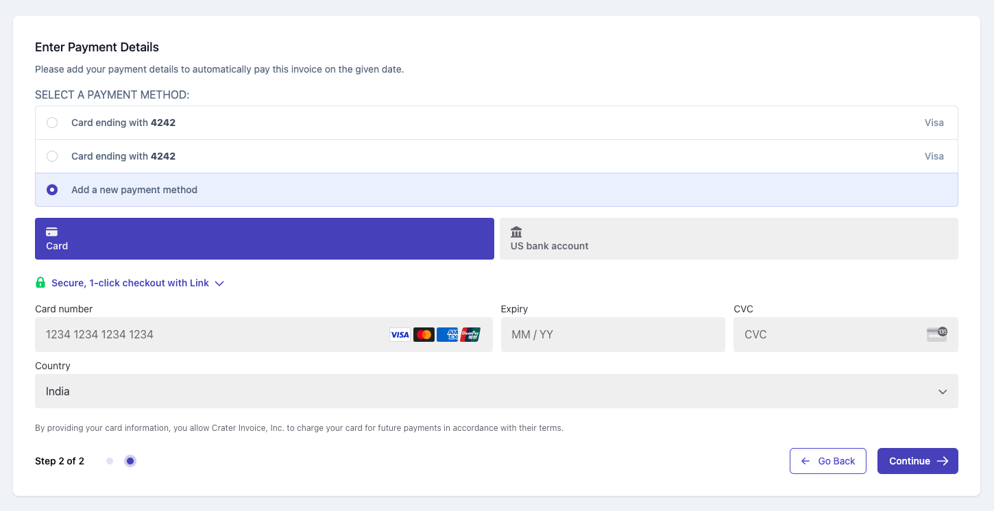
Usage
To approve existing invoice and schedule future payment, use the InvoiceApprove component with the invoice-id prop as shown:
InvoiceApprove.vue
import { InvoiceApprove } from '@crater/vue-sdk';

<InvoiceApprove id="INVOICE_ID" @succeeded="onInvoiceApprove" @error="handleError" />
Props
- Name
id- Type
- string
- Field Type
required- Description
This is a required prop that accepts the ID of the invoice.
Events
- Name
succeeded- Type
- Field Type
- Description
Triggered when the invoice approved successfully.
- Name
error- Type
- Field Type
- Description
Triggered if the invoice approve has some issue.
Recurring Invoice Table
This component displays a table of all recuring invoices. The component shows each recurring invoice's repeat interval, total and status as well as other required details.
Preview
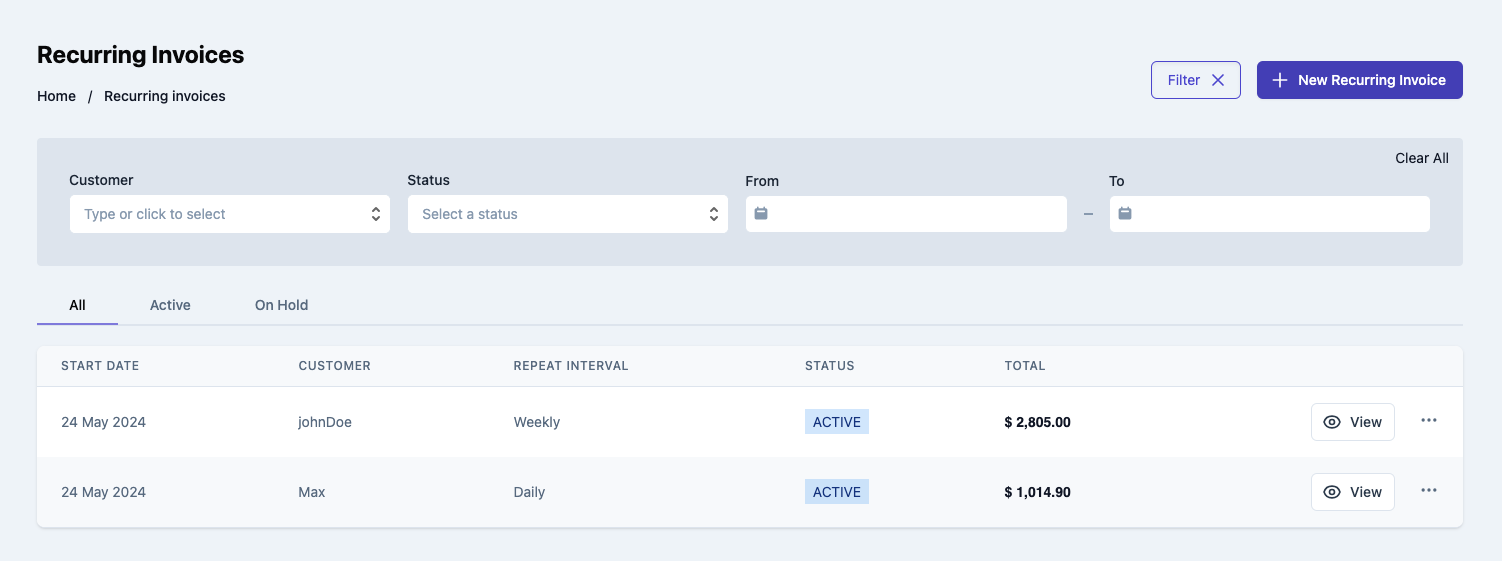
Usage
Renders a table of recurring invoice. Use the RecurringInvoiceTable component in your application as shown below:
RecurringInvoiceTable.vue
import { RecurringInvoiceTable } from '@craterapp/vue-sdk';

<RecurringInvoiceTable
  :show-filters="false"
  :show-table-title="false"
  :show-Tabs="false"
  :show-create-button="false"
  :show-recurring-edit-option="false"
  :show-recurring-delete-option="false"
  :show-view-option="false"
  :show-view-button="false"
  @create="onRecurringInvoiceCreate"
  @edit="onRecurringInvoiceEdit"
  @view="onRecurringInvoiceView"
/>
Props
- Name
show-filters- Type
- boolean
- Field Type
optional- Description
This prop accepts boolean value to show / hide filters button, default value is
true.
- Name
apply-filters- Type
- object
- Field Type
optional- Description
This prop accepts object with 'customer_id', 'status', 'from_date', 'to_date' key and its value for applying filter.
- Name
show-table-title- Type
- boolean
- Field Type
optional- Description
This prop accepts boolean value to show / hide recurring invoice table title, default value is
true.
- Name
show-Tabs- Type
- boolean
- Field Type
optional- Description
This prop accepts boolean value to show / hide recurring invoice status tabs, default value is
true.
- Name
show-create-button- Type
- boolean
- Field Type
optional- Description
This prop accepts boolean value to show / hide recurring invoice create button, default value is
true.
- Name
show-recurring-edit-option- Type
- boolean
- Field Type
optional- Description
This prop accepts boolean value to show / hide recurring invoice edit option, default value is
true.
- Name
show-recurring-delete-option- Type
- boolean
- Field Type
optional- Description
This prop accepts boolean value to show / hide recurring invoice delete option, default value is
true.
- Name
show-view-option- Type
- boolean
- Field Type
optional- Description
This prop accepts boolean value to show / hide recurring invoice view option, default value is
true.
- Name
show-view-button- Type
- boolean
- Field Type
optional- Description
This prop accepts boolean value to show / hide recurring invoice view button, default value is
true.
- Name
columns- Type
- array
- Field Type
optional- Description
This prop accepts array to customize columns of table. you can pass columns key which you want to show in table.
Available keys:
['start_date', 'name', 'repeat_interval', 'status', 'total', 'view_action', 'actions']Example:
If you pass['start_date', 'name', 'repeat_interval',], the table will only display these columns.Additionally, you can pass an array of objects with available keys (
'key', 'label', 'thClass', 'tdClass', 'sortable') to override the default properties of a column.<RecurringInvoiceTable :columns="[{ key: 'name', label: 'Customer Name', thClass: 'table-cell', tdClass: 'table-cell', sortable: true, }]" />You can also pass a combination of both arrays and objects to customize the columns of the table.
<RecurringInvoiceTable
  :columns="[
    'name',
    {
      key: 'status',
      label: 'Status',
      sortable: false
    }
  ]"
/>
Events
- Name
create- Type
- Field Type
- Description
Triggered when recurring invoice create button clicked.
- Name
view- Type
- Field Type
- Description
Triggered when recurring invoice view option clicked from options menu.
- Name
edit- Type
- Field Type
- Description
Triggered when recurring invoice edit option clicked from options menu.
Slots
- Name
customHeader- Type
- Field Type
- Description
This slot allows you to add custom header in recurring invoice table component.
<RecurringInvoiceTable>
  <template #customHeader>
    <div class="flex justify-between">
      <h1 class="text-2xl">
        Recurring Invoices
      </h1>
      <div class="flex items-center">
        <button type="button" class="mr-2">
          Create
        </button>
      </div>
    </div>
  </template>
</RecurringInvoiceTable>
- Name
breadcrumb- Type
- Field Type
- Description
This slot allows you to add custom breadcrumb in recurring invoice table component.
  <RecurringInvoiceTable>
    <template #breadcrumb>
      <Breadcrumb>
        <BreadcrumbItem title="Home" />
        <BreadcrumbItem title="Recurring Invoices" active/>
      </Breadcrumb>
    </template>
  </RecurringInvoiceTable>
Recurring Invoice Details
This component renders the interface for displaying an existing recurring invoice. It also allows performing various actions on the recurring invoice such as editing and deleting it.
Preview
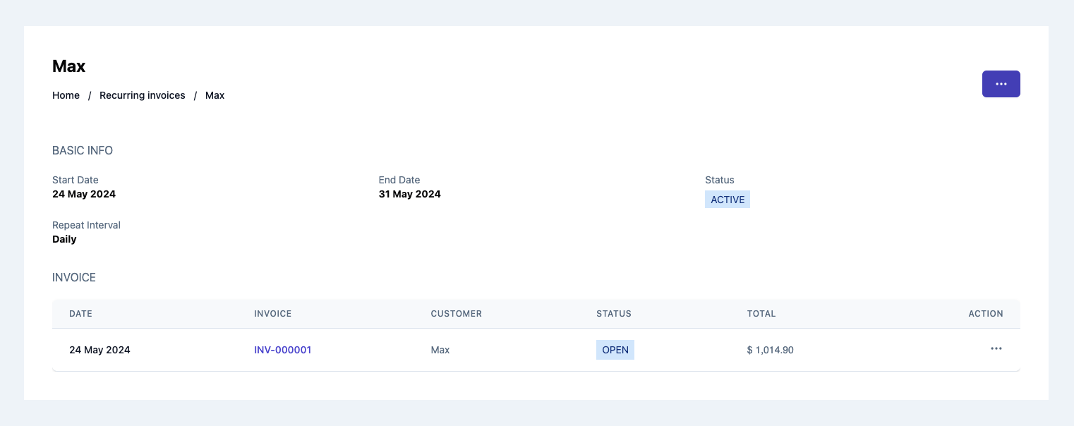
Usage
To view details of an existing recurring invoice, use the RecurringInvoiceDetails component with the id prop as shown:
RecurringInvoiceDetails.vue
import { RecurringInvoiceDetails } from '@craterapp/vue-sdk';

<RecurringInvoiceDetails
  id="RECURRING_INVOICE_ID"
  :show-recurring-edit-option="false"
  :show-recurring-delete-option="false"
  :show-edit-option="false"
  :show-delete-option="false"
  :show-view-option="false"
  :show-send-invoice="false"
  :show-clone-invoice="false"
  :show-void-option="false"
  @edit="onRecurringInvoiceEdit"
  @invoice:view="onInvoiceView"
  @invoice:edit="onInvoiceEdit"
/>
Props
- Name
id- Type
- string
- Field Type
required- Description
This is a required prop that accepts the ID of the recurring invoice details to be displayed.
- Name
show-recurring-edit-option- Type
- boolean
- Field Type
optional- Description
This is a optional prop that accepts the boolean value to show / hide edit recurring invoice option, default value is
true.
- Name
show-recurring-delete-option- Type
- boolean
- Field Type
optional- Description
This is a optional prop that accepts the boolean value to show / hide delete recurring invoice option, default value is
true.
- Name
show-edit-option- Type
- boolean
- Field Type
optional- Description
This is a optional prop that accepts the boolean value to show / hide edit invoice option, default value is
true.
- Name
show-delete-option- Type
- boolean
- Field Type
optional- Description
This is a optional prop that accepts the boolean value to show / hide delete invoice option, default value is
true.
- Name
show-view-option- Type
- boolean
- Field Type
optional- Description
This is a optional prop that accepts the boolean value to show / hide view invoice option, default value is
true.
- Name
show-send-invoice- Type
- boolean
- Field Type
optional- Description
This is a optional prop that accepts the boolean value to show / hide send invoice option, default value is
true.
- Name
show-clone-invoice- Type
- boolean
- Field Type
optional- Description
This is a optional prop that accepts the boolean value to show / hide clone invoice, default value is
true.
- Name
show-void-option- Type
- boolean
- Field Type
optional- Description
This is a optional prop that accepts the boolean value to show / hide void invoice option, default value is
true.
Events
- Name
edit- Type
- Field Type
- Description
Triggered when recurring invoice edit option clicked.
- Name
invoice:view- Type
- Field Type
- Description
Triggered when invoice edit option clicked.
- Name
invoice:edit- Type
- Field Type
- Description
Triggered when invoice edit option clicked.
Slots
- Name
customHeader- Type
- Field Type
- Description
This slot allows you to add custom header in recurring invoice details component.
<RecurringInvoiceDetails id="RECURRING_INVOICE_ID">
  <template #customHeader>
    <div class="flex justify-between">
      <h1 class="text-2xl">
        Recurring Invoice
      </h1>
      <div class="flex items-center">
        <button type="button" class="mr-2">
          Edit
        </button>
      </div>
    </div>
  </template>
</RecurringInvoiceDetails>
- Name
breadcrumb- Type
- Field Type
- Description
This slot allows you to add custom breadcrumb in recurring invoice details component.
  <RecurringInvoiceDetails id="RECURRING_INVOICE_ID">
    <template #breadcrumb="slotProps">
      <Breadcrumb>
        <BreadcrumbItem title="Home" />
        <BreadcrumbItem :title="slotProps.data.recurringInvoiceData.customer?.name" active/>
      </Breadcrumb>
    </template>
  </RecurringInvoiceDetails>
Recurring Invoice Create
This component serves as an interface for users to input and submit information essential for generating a new rucurring invoice. It handles the UI elements & data validation to create recurring invoices within your application.
Preview
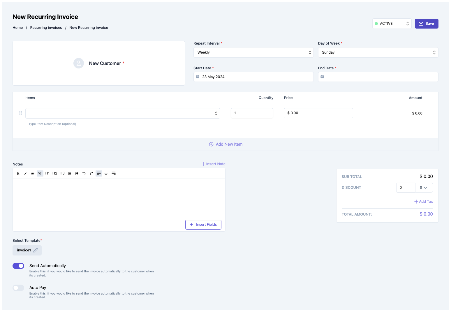
Usage
Renders a form for creating a new recurring invoice. Use the RecurringInvoiceCreate component in your application as shown below:
RecurringInvoiceCreate.vue
import { RecurringInvoiceCreate } from '@craterapp/vue-sdk';

<RecurringInvoiceCreate :show-detail-on-success="false" @create="onRecurringInvoiceCreate" />
Props
- Name
show-detail-on-success- Type
- boolean
- Field Type
optional- Description
This prop accepts boolean value to show / hide recurring invoice details component after recurring invoice created successfully, default value is
true.
Events
- Name
create- Type
- function
- Field Type
- Description
Triggered when a recurring invoice is created successfully.
Slots
- Name
customHeader- Type
- Field Type
- Description
This slot allows you to add custom header in recurring invoice create component.
<RecurringInvoiceCreate>
  <template #customHeader>
    <div class="flex justify-between">
      <h1 class="text-2xl">
        Recurring Invoice Create
      </h1>
      <div class="flex items-center">
        <button type="button" class="mr-2">
          Save
        </button>
      </div>
    </div>
  </template>
</RecurringInvoiceCreate>
- Name
breadcrumb- Type
- Field Type
- Description
This slot allows you to add custom breadcrumb in recurring invoice create component.
  <RecurringInvoiceCreate>
    <template #breadcrumb>
      <Breadcrumb>
        <BreadcrumbItem title="Home" />
        <BreadcrumbItem title="Recurring Invoices" />
        <BreadcrumbItem title="New Recurring Invoices" active/>
      </Breadcrumb>
    </template>
  </RecurringInvoiceCreate>
Recurring Invoice Edit
This component renders a form for editing a pre-existing recurring invoice. It encompasses functionalities tailored to allow users to update specific details of an recurring invoice.
Preview
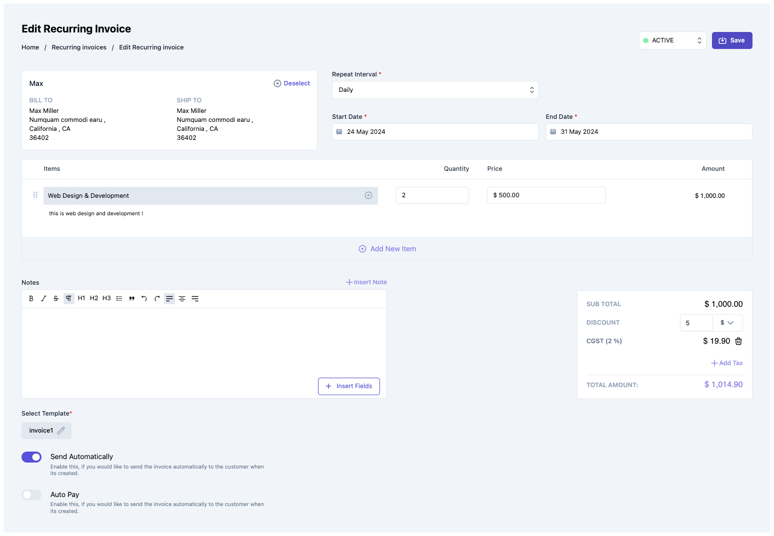
Usage
Renders a form for editing an existing recurring invoice. Use the RecurringInvoiceEdit component in your application as shown below:
RecurringInvoiceEdit.vue
import { RecurringInvoiceEdit } from '@craterapp/vue-sdk';

<RecurringInvoiceEdit id="RECURRING_INVOICE_ID" :show-detail-on-success="false" @edit="onRecurringInvoiceEdit" />
Props
- Name
id- Type
- string
- Field Type
required- Description
This is a required prop that accepts the ID of the recurring invoice.
- Name
show-detail-on-success- Type
- boolean
- Field Type
optional- Description
This prop accepts boolean value to show / hide recurring invoice details component after recurring invoice updated successfully, default value is
true.
Events
- Name
edit- Type
- Field Type
- Description
Triggered when the recurring invoice is updated successfully.
Slots
- Name
customHeader- Type
- Field Type
- Description
This slot allows you to add custom header in recurring invoice edit component.
<RecurringInvoiceEdit>
  <template #customHeader>
    <div class="flex justify-between">
      <h1 class="text-2xl">
        Recurring Invoice Edit
      </h1>
      <div class="flex items-center">
        <button type="button" class="mr-2">
          Save
        </button>
      </div>
    </div>
  </template>
</RecurringInvoiceEdit>
- Name
breadcrumb- Type
- Field Type
- Description
This slot allows you to add custom breadcrumb in recurring invoice edit component.
  <RecurringInvoiceEdit>
    <template #breadcrumb>
      <Breadcrumb>
        <BreadcrumbItem title="Home" />
        <BreadcrumbItem title="Recurring Invoices" />
        <BreadcrumbItem title="Edit Recurring Invoices" active/>
      </Breadcrumb>
    </template>
  </RecurringInvoiceEdit>
Payment Table
This component displays a table of all payments. The component shows each payment's payment date, business name and payment mode as well as other required details.
Preview
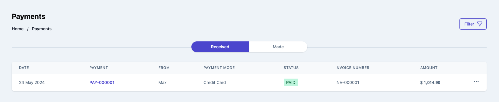
Usage
Renders a table of payments. Use in the PaymentTable component in your application as shown:
PaymentTable.vue
import { PaymentTable } from '@craterapp/vue-sdk';

<PaymentTable
  :show-filters="false"
  :apply-filters="false"
  :show-table-title="false"
  :show-view-option="false"
  :show-send-payment="false"
  @view="onPaymentView"
/>
Props
- Name
show-filters- Type
- boolean
- Field Type
optional- Description
This prop accepts boolean value to show / hide filters button, default value is
true.
- Name
apply-filters- Type
- object
- Field Type
optional- Description
This prop accepts object with
customer_business_id,payment_number,payment_mode,vendor_business_idkey and its value for applying filter.
- Name
show-table-title- Type
- boolean
- Field Type
optional- Description
This prop accepts boolean value to show / hide payment table title, default value is
true.
- Name
show-view-option- Type
- boolean
- Field Type
optional- Description
This prop accepts boolean value to show / hide payment delete option in table, default value is
true.
- Name
show-send-payment- Type
- boolean
- Field Type
optional- Description
This prop accepts boolean value to show / hide payment send option in table, default value is
true.
- Name
columns- Type
- array
- Field Type
optional- Description
This prop accepts array to customize columns of table. you can pass columns key which you want to show in table.
Available keys:
['payment_date', 'business_name', 'payment_mode', 'status', 'amount', 'invoice_number', 'actions']Example:
If you pass['business_name', 'payment_mode', 'status'], the table will only display these columns.Additionally, you can pass an array of objects with available keys (
'key', 'label', 'thClass', 'tdClass', 'sortable') to override the default properties of a column.<PaymentTable :columns="[{ key: 'business_name', label: 'Name', thClass: 'text-left', tdClass: 'text-left', sortable: true, }]" />You can also pass a combination of both arrays and objects to customize the columns of the table.
<PaymentTable
  :columns="[
    'business_name',
    {
      key: 'status',
      label: 'Status',
      sortable: false
    }
  ]"
/>
Slots
- Name
customHeader- Type
- Field Type
- Description
This slot allows you to add custom header in payment table component.
<PaymentTable>
  <template #customHeader>
    <div class="flex justify-between">
      <h1 class="text-2xl">
        Payments
      </h1>
    </div>
  </template>
</PaymentTable>
- Name
breadcrumb- Type
- Field Type
- Description
This slot allows you to add custom breadcrumb in payment table component.
  <PaymentTable>
    <template #breadcrumb>
      <Breadcrumb>
        <BreadcrumbItem title="Home" />
        <BreadcrumbItem title="Payments" active/>
      </Breadcrumb>
    </template>
  </PaymentTable>
Payment Details
This component renders the interface for displaying an existing payment.
Preview
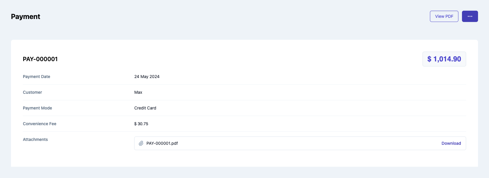
Usage
Use the PaymentDetails component to view details of an existing payment.
PaymentDetails.vue
import { PaymentDetails } from '@craterapp/vue-sdk';

<PaymentDetails id="PAYMENT_ID" :show-send-payment="false" />
Props
- Name
id- Type
- string
- Field Type
required- Description
This is a required prop that accepts the ID of the payment details to be displayed.
- Name
show-send-payment- Type
- boolean
- Field Type
optional- Description
This is a optional prop that accepts the boolean value to show / hide send payment option, default value is
true.
- Name
card-container-class- Type
- string
- Field Type
optional- Description
This prop is provided to the custom class for payment details.
Slots
- Name
customHeader- Type
- Field Type
- Description
This slot allows you to add custom header in payment details component.
<PaymentDetails id="PAYMENT_ID">
  <template #customHeader>
    <div class="flex justify-between">
      <h1 class="text-2xl">
        Payment
      </h1>
    </div>
  </template>
</PaymentDetails>
- Name
breadcrumb- Type
- Field Type
- Description
This slot allows you to add custom breadcrumb in payment details component.
  <PaymentDetails id="PAYMENT_ID">
    <template #breadcrumb="slotProps">
      <Breadcrumb>
        <BreadcrumbItem title="Home" />
        <BreadcrumbItem :title="slotProps.data.paymentData.payment_number" active/>
      </Breadcrumb>
    </template>
  </PaymentDetails>
Integration Settings
This component renders a list of integrations available on the given business. Users can choose to connect any of the given integration partners to automatically sync their data.
Preview
Usage
Import the IntegrationSettings component and use it in your application as shown below:
IntegrationSettings.vue
import { IntegrationSettings } from '@craterapp/vue-sdk';
<IntegrationSettings  />
Bread Crumb
This component is used for the breadcrumb on your page, contains a series of clickable links that represent the logical hierarchy of a user's journey within a website.
Preview
Usage
Renders a Breadcrumb. Use the Breadcrumb component in your application as shown below:
Breadcrumb.vue
import { Breadcrumb } from '@craterapp/vue-sdk';
import { BreadcrumbItem } from '@craterapp/vue-sdk';
import { ItemTable } from '@craterapp/vue-sdk';
<ItemTable>
  <template #breadcrumb >
    <Breadcrumb>
      <BreadcrumbItem title="Home" @click="onClick" />
      <BreadcrumbItem title="Items" active />
    </Breadcrumb>
  </template>
</ItemTable>
Additionally, you can pass the slotpProps like,
Breadcrumb.vue
import { Breadcrumb } from '@craterapp/vue-sdk';
import { BreadcrumbItem } from '@craterapp/vue-sdk';
import { ItemTable } from '@craterapp/vue-sdk';

<ItemTable>
  <template #breadcrumb="slotProps" >
    <Breadcrumb>
      <BreadcrumbItem title="Home" @click="onClick"/>
      <BreadcrumbItem :title="slotProps.data.itemData.name" @click="onItemClick" active />
    </Breadcrumb>
  </template>
</ItemTable>
Props
- Name
title- Type
- string
- Field Type
required- Description
This is a required prop that accepts the title of the breadcrumb to be displayed.
- Name
active- Type
- boolean
- Field Type
optional- Description
This prop accepts a boolean value to activate the breadcrumb display.
Events
- Name
click- Type
- Field Type
- Description
Triggered when a breadcrumb item is clicked.
Platform Overview Chart Widget
This component designed to provide a comprehensive overview of multiple businesses' data in a single chart. This component allows users to select a specific business to view its data, offering a versatile tool for comparing and analyzing different businesses' performances.
Platform access token is required to access this component, check the quickstart guide to get the platform access token.
Preview
Usage
PlatformOverviewChartWidget.vue
import { PlatformOverviewChartWidget } from '@craterapp/vue-sdk'

<PlatformOverviewChartWidget all-option-label="All Businesses" />
Props
- Name
all-option-label- Type
- string
- Field Type
optional- Description
This is a optional prop that accepts string for lable to display in dropdown for
all businessesoption. like if you passAll, the dropdown will showAllas option instead ofAll Businessesoption.
Slots
- Name
default- Type
- Field Type
- Description
You can use default slot to add custom content in platform overview chart widget.
Example:
PlatformOverviewChartWidget.vue
import { PlatformOverviewChartWidget } from '@craterapp/vue-sdk'

<PlatformOverviewChartWidget all-option-label="All Businesses">
  <div>
    <h1>Custom Content</h1>
  </div>
</PlatformOverviewChartWidget>
Business Overview vertical Bar Chart Widget
This component designed to provide a comprehensive overview of key business metrics through a vertical bar chart. This component visualizes the total sales, revenue, purchases, and payments of the current business, offering a clear and dynamic representation of these critical data points.
Preview
Usage
BusinessOverviewVerticalBarChartWidget.vue
import { BusinessOverviewVerticalBarChartWidget } from '@craterapp/vue-sdk'

<BusinessOverviewVerticalBarChartWidget
  title="Business Overview"
  type="sales"
  interval="monthly"
/>
Props
- Name
title- Type
- string
- Field Type
optional- Description
This is a optional prop that accepts string for title of the chart.
- Name
counter-business-id- Type
- string
- Field Type
optional- Description
This is a optional prop that accepts id of counter business for display chart with current business.
- Name
type- Type
- string
- Field Type
optional- Description
This is a optional prop that accepts string for type of chart to display. like if you pass
sales, the chart will display sales chart.Available types:
['sales', 'revenue', 'purchases', 'payments']
- Name
start-date- Type
- string
- Field Type
optional- Description
This is a optional prop that accepts string for start-date in
'YYYY-MM-DD'format.
- Name
end-date- Type
- string
- Field Type
optional- Description
This is a optional prop that accepts string for end-date in
'YYYY-MM-DD'format.
- Name
interval- Type
- string
- Field Type
optional- Description
This is a optional prop that accepts interval for the chart data, which can be "monthly", "quarterly", or "yearly". This prop determines how the data points are aggregated and displayed.
Available interval:
['monthly', 'quarterly', 'yearly']
Slots
- Name
header- Type
- Field Type
- Description
You can use header slot to add custom header content in business overview chart widget.
- Name
footer- Type
- Field Type
- Description
You can use footer slot to add custom header content in business overview chart widget.
Example:
BusinessOverviewVerticalBarChartWidget.vue
import { BusinessOverviewVerticalBarChartWidget } from '@craterapp/vue-sdk'

  <BusinessOverviewVerticalBarChartWidget
    v-if="false"
    title="Business Overview"
    type="sales"
    interval="yearly"
    start-date="2020-01-01"
    end-date="2021-12-31"
  >
    <template #header="slotpProps">
      <div class="py-5">
        {{ 'this is headr' }}
      </div>
    </template>
    <template #footer>
      <div class="text-xl">
        {{ 'this is footer' }}
      </div>
    </template>
  </BusinessOverviewVerticalBarChartWidget>
Business Overview Line Chart Widget
This component designed to provide a comprehensive overview of key business metrics through a line chart. This component visualizes the total sales, revenue, purchases, and payments of the current business, offering a clear and dynamic representation of these critical data points.
Preview
Usage
BusinessOverviewLineChartWidget.vue
import { BusinessOverviewLineChartWidget } from '@craterapp/vue-sdk'

<BusinessOverviewLineChartWidget label="Sales & Receipts" :types="['sales', 'revenue']" interval="monthly"/>
Props
- Name
label- Type
- string
- Field Type
optional- Description
This is a optional prop that accepts string for title of the chart.
- Name
counter-business-id- Type
- string
- Field Type
optional- Description
This is a optional prop that accepts id of counter business for display chart with current business.
- Name
types- Type
- array
- Field Type
optional- Description
This is a optional prop that accepts string for type of chart to display. like if you pass
sales, the chart will display sales details.Available types:
['sales', 'revenue', 'purchases', 'payments']
- Name
start-date- Type
- string
- Field Type
optional- Description
This is a optional prop that accepts string for start-date in
'YYYY-MM-DD'format.
- Name
end-date- Type
- string
- Field Type
optional- Description
This is a optional prop that accepts string for end-date in
'YYYY-MM-DD'format.
- Name
interval- Type
- string
- Field Type
optional- Description
This is a optional prop that accepts interval for the chart data, which can be "monthly", "quarterly", or "yearly". This prop determines how the data points are aggregated and displayed, default value is
monthly.Available interval:
['monthly', 'quarterly', 'yearly']
Example:
BusinessOverviewLineChartWidget.vue
import { BusinessOverviewLineChartWidget } from '@craterapp/vue-sdk'

<BusinessOverviewLineChartWidget :types="['sales','revenue']" />
Slots
- Name
header- Type
- Field Type
- Description
You can use header slot to add custom header content in business overview chart widget.
- Name
footer- Type
- Field Type
- Description
You can use footer slot to add custom header content in business overview chart widget.
Example:
BusinessOverviewLineChartWidget.vue
import { BusinessOverviewLineChartWidget } from '@craterapp/vue-sdk'

  <BusinessOverviewLineChartWidget
    v-if="false"
    title="Business Overview"
    type="sales"
    interval="yearly"
    start-date="2020-01-01"
    end-date="2021-12-31"
  >
    <template #header="slotpProps">
      <div class="py-5">
        {{ 'this is headr' }}
      </div>
    </template>
    <template #footer>
      <div class="text-xl">
        {{ 'this is footer' }}
      </div>
    </template>
  </BusinessOverviewLineChartWidget>